Advanced List
“EAE Advanced List” is a powerful tool that enables you to organize your list in a more efficient and visually appealing manner. This feature allows you to customize individual list items with unique styles and designs, such as adding badges to certain items.
It offers various layout options to display your list, including horizontal and vertical orientation. You can also choose to use a grid view for a more structured and organized representation.
The “Advanced List” widget features the following controls:
Content
General
- List
Content
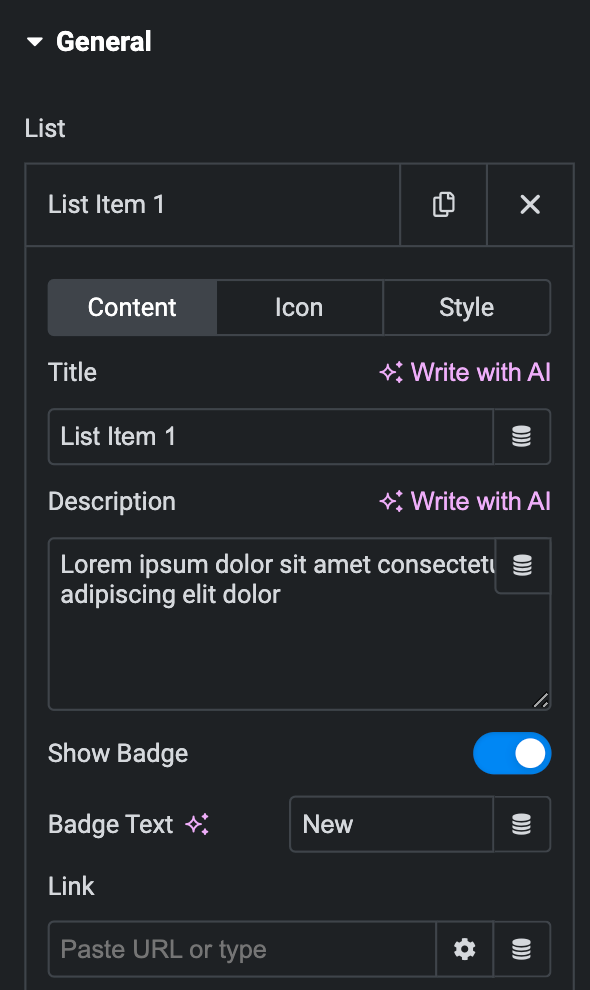
- Title: Enter the title for the list.
- Description: Enter the description for the list item.
- Show Badge: Toggle the badge as desired.
- Badge Text: Enter the text for the badge.
- Link: Enter the link for applying to the list.
Icon
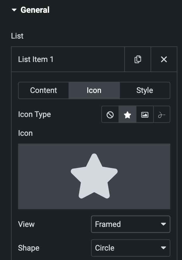
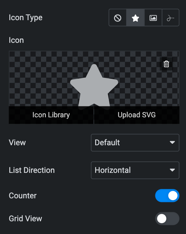
- Icon Type- Choose from a list of Icons, Images, or Lottie animations.
- Icon
- Icon: Select from the Font Awesome icon library or upload an SVG image.
- Image
- Image: Either upload an image or select a dynamic tag for display.
- Image size: Choose the size for your icon image display.
- Lottie Animation
- Source: Choose the source of the Icon by either adding an External URL or selecting a media file.
- Loop: Enable the loop option to display the animation continuously.
- Reverse: Activate the reverse option to display the animation in reverse order.
- Icon
- View – Select from default, stacked, or framed display options.
- Shape – Select either Circle or Square shape for the stack or frame.
Style(for individual item)
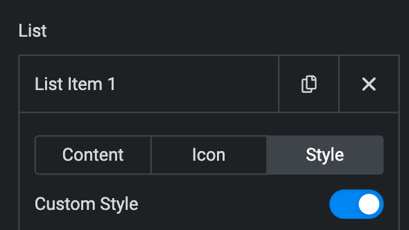
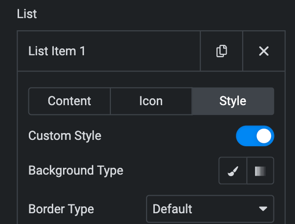
- Custom Style: Toggle the Custom Style as desired.
Normal
- Background Type: Choose either a Classic or a Gradient.
- Classic
- Color: Choose the color for the background.
- Image: Either upload an image or select a dynamic tag for display.
- Gradient
- Color: Select the color for the background.
- Location: Determine the position of the color on the background by specifying their location in percentage.
- Second Color: Select the second color for the background.
- Location: Determine the position of the second color on the background by specifying their location in percentage.
- Type: Select either Radial or Linear.
- Radial
- Position: Set the position.
- Linear
- Angle: Set the angle using DEG, GRAD, RAD, and TURN.
- Radial
- Classic
- Border Type: Select the type of border.
- Width: Enter the width for the border.
- Color: Specify the color of the border
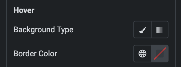
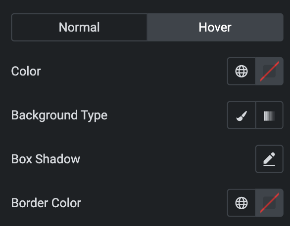
Hover
Styling controls for the hover state are available under this section. These settings will be applied when Someone hovers the item box.
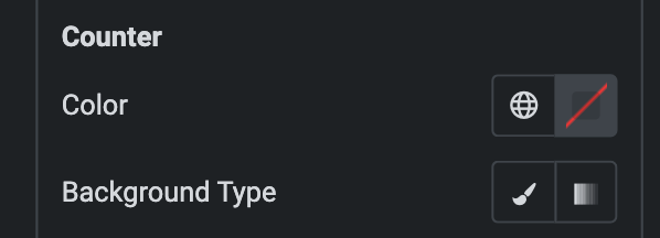
Counter
- Color: Choose the color for the counter.
- Background Type: As we mentioned above, Choose either a Classic or a Gradient. Click here.
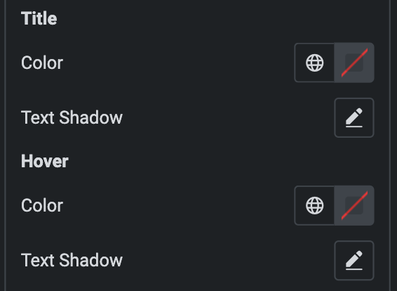
Title
- Normal
- Color: Choose the color for the Title.
- Text Shadow: Apply a shadow to the title if desired.
- Hover
- Color: Choose the color for the Title hover.
- Text Shadow: Apply a shadow to the title hover if desired.
Description
- Normal
- Color: Choose the color for the description.
- Hover
- Color: Choose the color for the description.
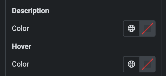
Badge
- Normal
- Color: Choose the color for the badge.
- Background Type: As we mentioned above, Choose either a Classic or a Gradient. Click here.
- Hover
- Styling controls for the hover state are available under this section. These settings will be applied when Someone hovers the badge.
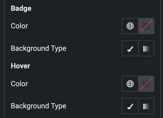
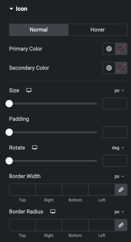
Icon
- Normal
- Primary Color: Choose the primary color for the icon.
- Secondary Color: Choose the secondary color for the icon.
- Size: Set the size of the Icon using %, EM, REM, VW, or PX.
- Padding: Set the padding.
- Rotate: Set the rotation of your Icon.
- Border Width: Set the border’s width using %, EM, REM, VW, or PX.
- Border Radius: Set the border’s radius using PX, %, EM, or REM.
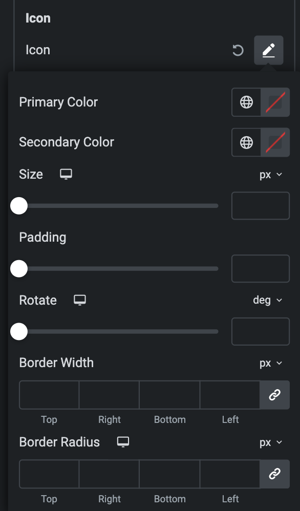
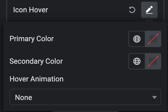
- Hover
Styling controls for the hover state are available under this section. These settings will be applied when Someone hovers the icon.
- Icon Type: As we mentioned above, Choose from a list of Icons, Images, or Lottie animations. Click here.
- List Direction: Choose either Vertical or Horizontal.
- Counter: Activate the option to add a Counter to your list.
- Grid View: Enable the Grid View option if desired.
- Column: Specify the number of columns to display in a single row.
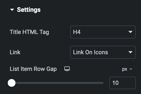
Settings
- Title HTML Tag: Select the html tag for the title.
- Link: Select on which you want to apply the link, “Icon” or “list.”
- List Item Row Gap: Specify the gap between the list item rows(applicable if you enable Grid View).
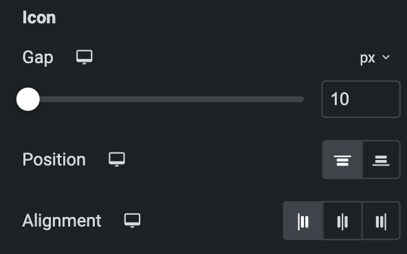
Icon
- Gap: Specify the gap between the icon and the list items.
- Position: Select the position of the icon, either “right” or “left.”
- Alignment: Select the alignment of the icon.
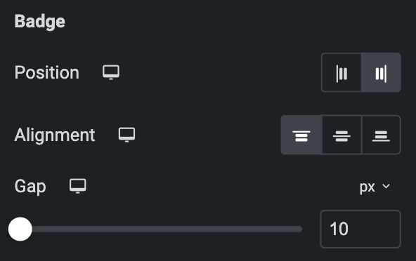
Badge
- Position: Select the position of the badge, either “right” or “left.”
- Alignment: Select the alignment of the badge.
- Gap: Specify the gap between the badge and the list items.
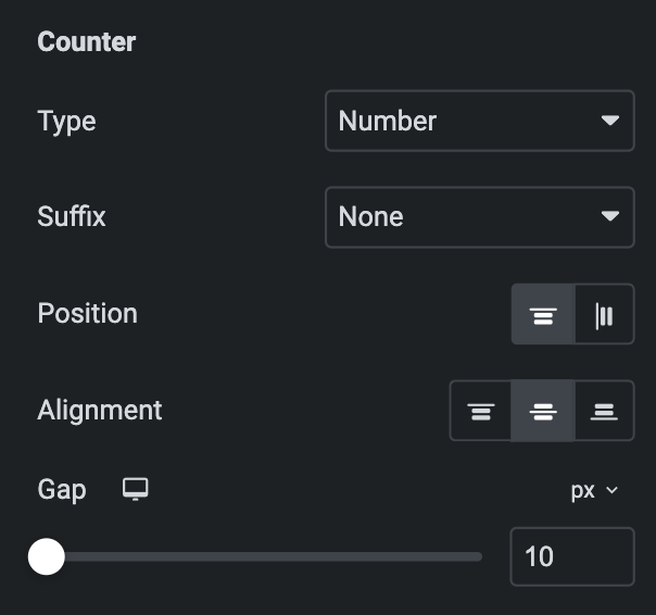
Counter
Note: This option is only applicable if we enable Counter in the content section.
- Type: Select the type of Counter.
- Suffix: Select a suffix from the options of colon, dot, or bracket.
- Position: Select either Vertical or Horizontal(applicable if List Direction is selected as Horizontal).
- Alignment: Select the alignment of the Counter.
- Gap: Specify the gap between the counter and the list items.
Style
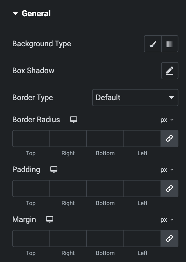
General
- Background Type: As we mentioned above, Choose either a Classic or a Gradient. Click here.
- Box Shadow: Set the box shadow.
- Border Type: Select the type of border.
- Width: Enter the width for the border.
- Color: Specify the color of the border.
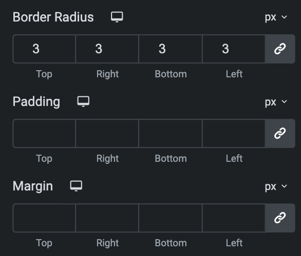
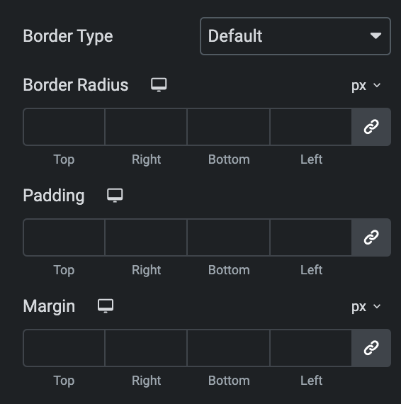
- Border Radius: Set the border’s radius using PX or %.
- Padding: Set the padding using PX or %.
- Margin: Set the margin using PX or %.
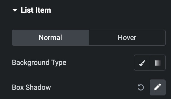
List Item
- Normal
- Background Type: As we mentioned above, Choose either a Classic or a Gradient. Click here.
- Box Shadow: Set the box shadow.
- Hover
Styling controls for the hover state are available under this section. These settings will be applied when Someone hovers the list item box.
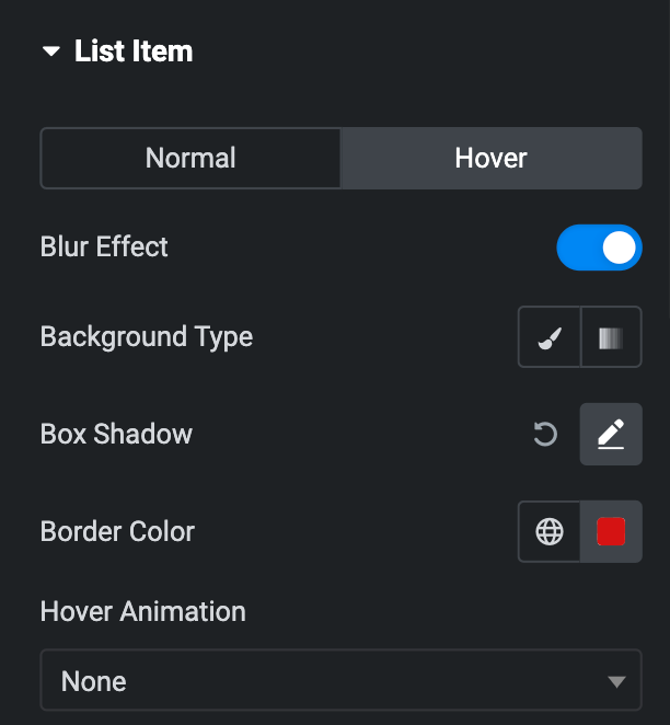
- Border Type: Select the type of border.
- Width: Enter the width for the border.
- Color: Specify the color of the border.
- Border Radius: Set the border’s radius using PX or %.
- Padding: Set the padding.
- Margin: Set the margin using PX or %.
Counter
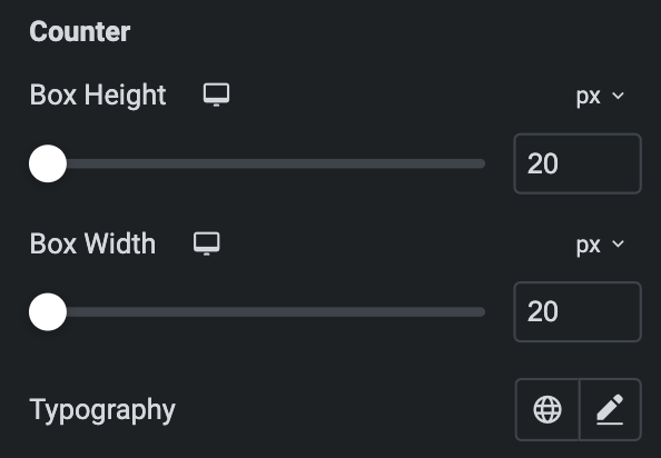
- Box Height: Set the box height.
- Box Width: Set the box width.
- Typography: Set the typography for the counter.
- Normal
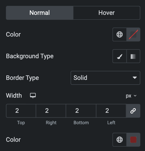
- Color: Specify the color for the counter.
- Background Type: As we mentioned above, Choose either a Classic or a Gradient. Click here.
- Border Type: Select the type of border.
- Width: Enter the width for the border.
- Color: Specify the color of the border.
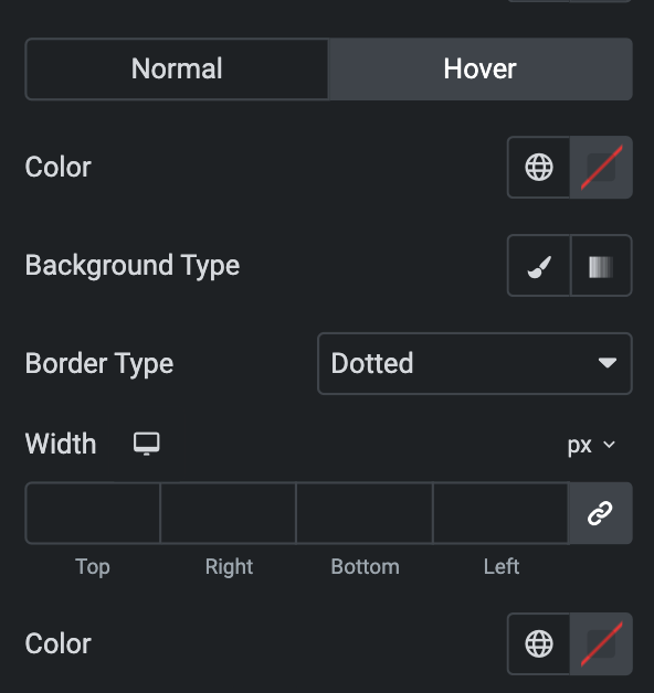
- Hover
Styling controls for the hover state are available under this section. These settings will be applied when Someone hovers the counter.
- Border Radius: Set the border’s radius using PX or %.
- Padding: Set the padding.
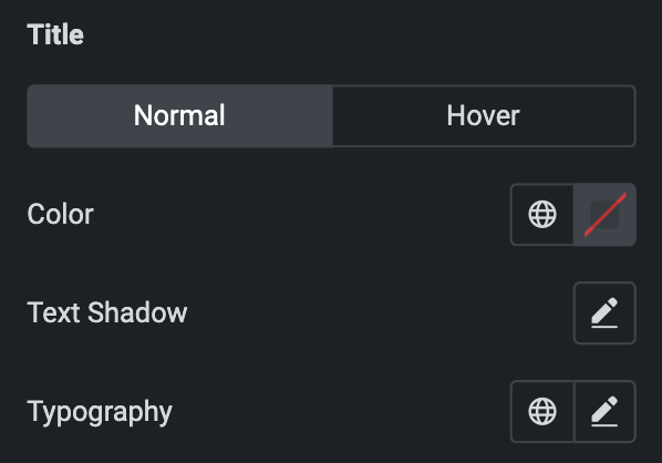
Title
- Normal
- Color: Choose the color for the Title.
- Text Shadow: Apply a shadow to the title if desired.
- Hover
- Styling controls for the hover state are available under this section. These settings will be applied when Someone hovers the title.
- Typography: Set the typography for the title.
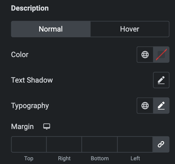
Description
- Normal
- Color: Choose the color for the description.
- Text Shadow: Apply a shadow to the title if desired.
- Typography: Set the typography for the description.
- Hover
- Styling controls for the hover state are available under this section. These settings will be applied when Someone hovers the description.
- Margin: Set the margin for description.
Icon
Styling controls for the Normal and hover state are available under this section. Hover settings will be applied when Someone hovers the icon. Click here.
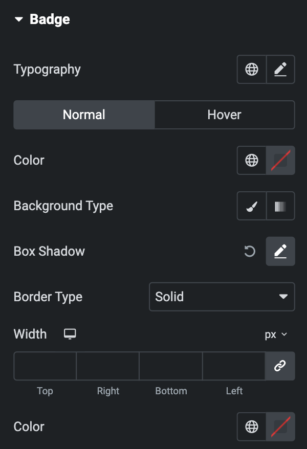
Badge
- Typography: Set the typography for the badge.
- Normal
- Color: Set the color for the badge text.
- Background Type: As we mentioned above, Choose either a Classic or a Gradient. Click here.
- Box Shadow: Set the box shadow.
- Border Type: Select the type of border.
- Width: Enter the width for the border.
- Color: Specify the color of the border.
- Normal
- Hover
- Styling controls for the hover state are available under this section. These settings will be applied when Someone hovers the badge.
- Border Radius: Set the border’s radius using PX or %.
- Padding: Set the padding.
- Margin: Set the margin using PX or %.
