Instagram Feed
The “EAE – Instagram Feed” is a dynamic widget that allows you to seamlessly integrate your Instagram photos, videos, and albums directly onto your website. With this widget, you can effortlessly showcase your captivating visual content to your visitors.
One of its standout features is the requirement of a unique token to identify individual Instagram IDs, ensuring a secure and personalized experience. It provides a variety of layout options, allowing you to choose the perfect presentation style for your feed.
Additionally, you have the ability to display customizable caption for each post, adding depth and context to your content.
The Instagram Feed widget features the following controls:
Content
Profile
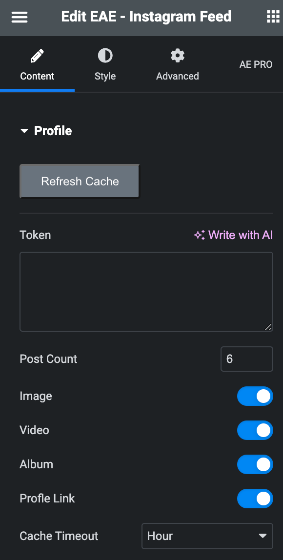
- Refresh Cache: Click the option to refresh the generated cache.
- Token: Enter the token provided by us.
- Post Count: Specify the desired number of posts you would like to be displayed.
- Image: Enable the option to display posts that include images.
- Video: Enable the option to display posts that include videos.
- Album: Enable the option to show posts that include albums.
- Profile Link: Enable the option to show your profile link.
- Cache Timeout: Specify the time when you want to cache timeout.
Layout
- Layout: Select the layout from options available.
- Grid/Masonry
- Columns: Specify the number of columns in each row.
- Column Gap: Specify the gap between columns.
- Row Gap: Specify the gap between rows.
- Grid/Masonry
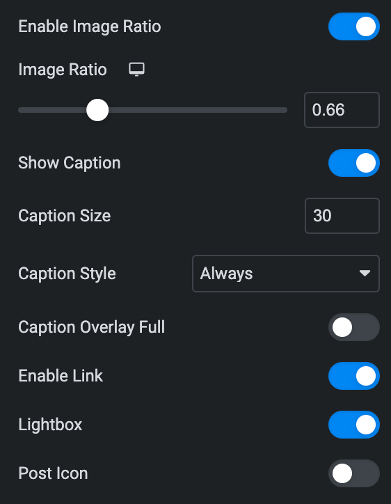
- Enable Image Ratio: Enable the option if needed.
- Image Ratio: Enter the value for ratio.
- Show Caption:
- Caption Size: Specify the size for caption.
- Caption Style: Select from Below, On Hover, or always.
- Caption Overlay Full: Enable the option to show caption as overlay.
- Enable Link: Enable the option if needed.
- Lightbox: Activate the option If you would like to enable the lightbox feature.
- Post Icon: Activate the option to display the post icon.
Profile Link
Note: This option is applicable if the Profile Link option is enabled under Profile section.
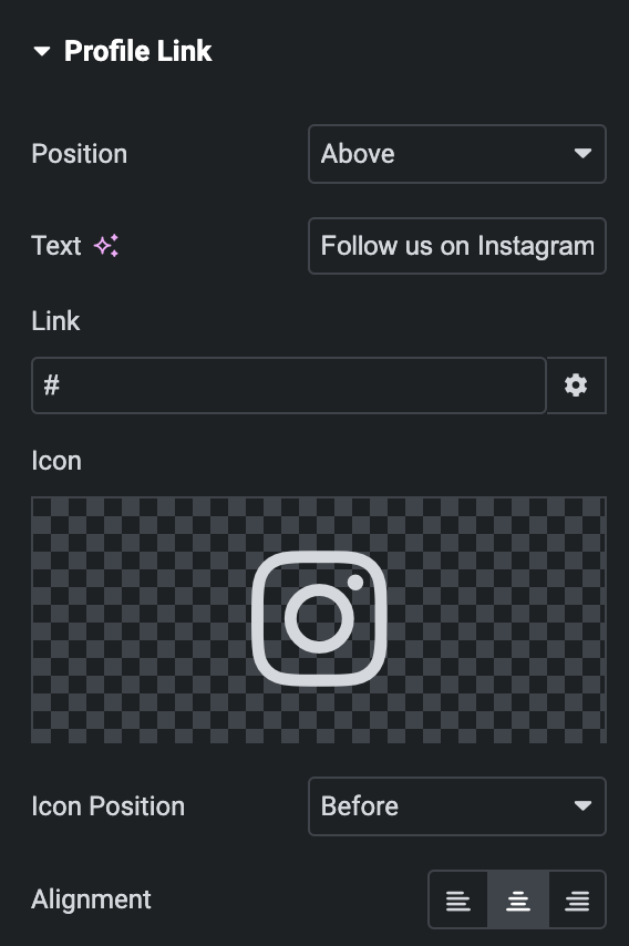
- Position: Select either below or above.
- Text: Enter the text for profile link.
- Link: Specify the URL to link with profile.
- Icon: Select the icon.
- Icon Position: Choose either before or after.
- Alignment: Select the alignment of icon.
Flex
Note: This option is applicable if Layout is selected as Flex.
Items
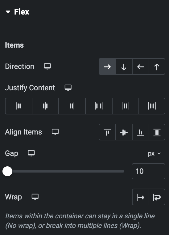
- Direction: Select the flex direction for post.
- Justify Content: Specify the justify content property.
- Align Items: Specify the align items property.
- Gap: Specify the gap between the posts.
- Wrap: Select either wrap or No wrap.
Carousel
Note: This option is applicable if Layout is selected as Carousel.
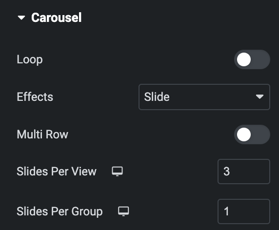
- Loop: Enable the option to display posts in loop.
- Effects: Select the effect from the given options.
- Multirow: Activate the option to display multiple rows (applicable when Loop is disabled).
- Slide Per View: Specify the number of slides to display per view.
- Slide Per Group: Specify the number of slides to display per group.
Setting
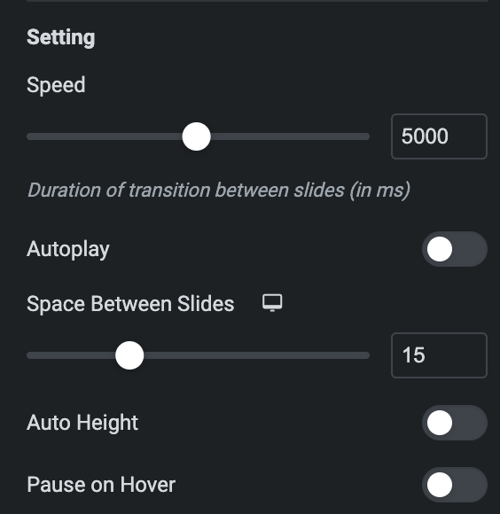
- Speed: Set the speed.
- Autoplay: Enable the option to play the carousel automatically.
- Duration: Set the duration.
- Space Between Slides: Specify the space between slides.
- Auto Height: Enable the option if needed.
- Pause On Hover: Activate the option to pause slides on hover.
Pagination
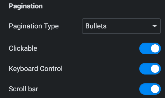
- Pagination Type: Select the type of pagination from bullets, Progress Bar, and Fraction.
- Clickable: Enable the option to make pagination clickable(applicable for Bullets Pagination type).
- Keyboard Control: Activate the option to enable keyboard control on pagination.
- Scroll Bar: Enable the option to display scroll bar.
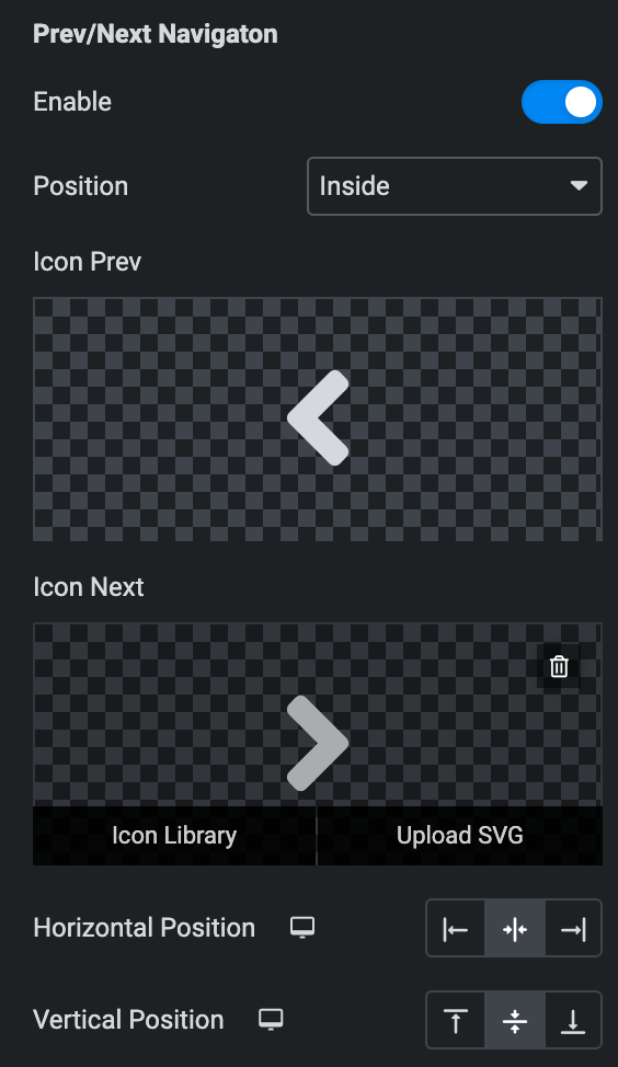
Prev/Next Navigation
- Enable: Enable the option if needed.
- Position: Select either inside or outside.
- Icon Prev: Select the icon for previous navigation.
- Icon Next: Select the icon for Next navigation.
- Horizontal Position: Select the horizontal position of navigation(applicable if navigation position is selected as inside).
- Vertical Position: Select the horizontal position of navigation(applicable if navigation position is selected as inside).
LightBox
Note: This option is applicable if Lightbox is enabled in Layout Section.
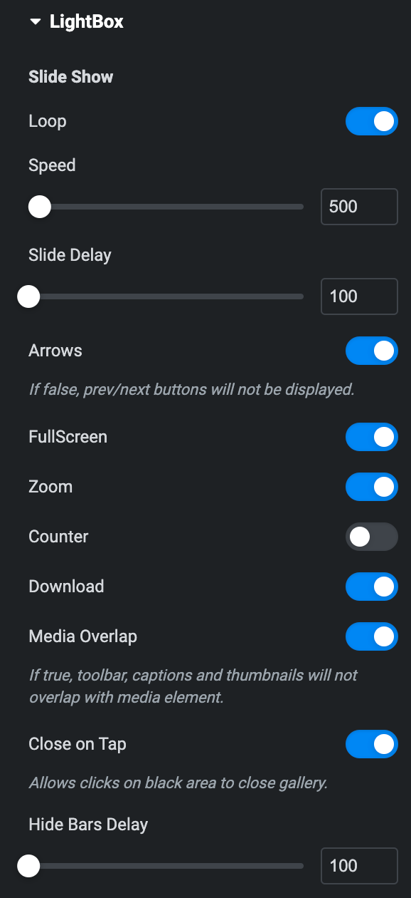
Slide Show
- Loop: Enable the option to display posts in loop upon the lightbox.
- Speed: Set the speed.
- Slide Delay: Specify the value to delay the slide.
- Arrows: Enable the option to display arrows.
- Full Screen: Activate the option to display lightbox in fullscreen.
- Zoom: Enable the option to show lighbox in zoom mode upon page load.
- Counter: Enable the option to display counter.
- Download: Activate the option to enable download.
- Media Overlap: Activate the option to enable the overlap.
- Close On Tap: Enable the option to close the gallery while tap on black area.
- Hide Bar Delay: Set the hide delay duration.
Video
- Autoplay: Enable the option to autoplay the video on slide change.

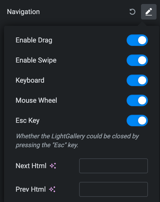
Navigation
- Enable Drag: Activate the option to enable dragging.
- Enable Swipe: Activate the option to enable swipe(only for screen touch devices).
- Keyboard: Activate the option to enable keyboard control.
- Mouse Wheel: Activate the option to enable mouse wheel feature.
- Esc: Enable the option to close the lightbox gallery by pressing Esc key.
- Next HTML: Enter the HTML for navigation next icon.
- Previous HTML: Enter the HTML for navigation previous icon.
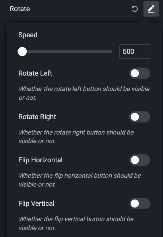
Rotate
- Speed: Set the speed of rotation.
- Rotate Left: Activate the option to displayed in Lightbox.
- Rotate Right: Activate the option to displayed in Lightbox.
- Flip Horizontal: Activate the option to displayed in Lightbox.
- Flip Vertical: Activate the option to displayed in Lightbox.
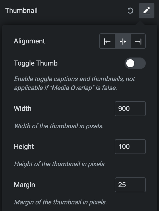
Thumbnail
- Alignment: Select the alignment of thumbnail.
- Toggle Thumb: Enable the option if needed(not applicable if Media Overlap is false).
- Width: Set the width of thumbnail.
- Height: Set the height of thumbnail.
- Margin: Set the margin.
Hash URL
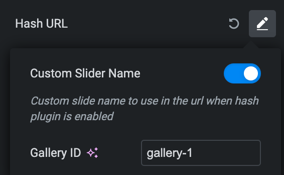
Note: Custom Slider Name will work as url if Hash Url plugin is installed.
- Custom Slider Name: Enable the option to give unique name.
- Gallery ID: Enter the unique id.
Share
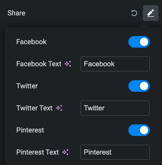
- Facebook
- Facebook Text: Enter the text for facebook share option.
- Twitter
- Twitter Text: Enter the text for Twitter share option.
- Pinterest
- Pinterest Text: Enter the text for Pinterest share option.
Style
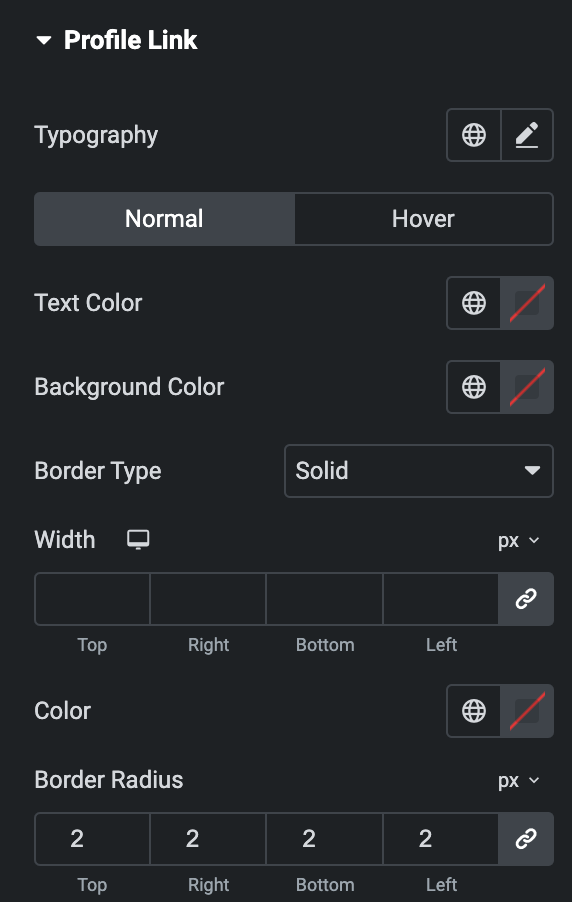
Profile Link
Note: This option is applicable if the Profile Link option is enabled under Profile section.
- Typography: Set the typography.
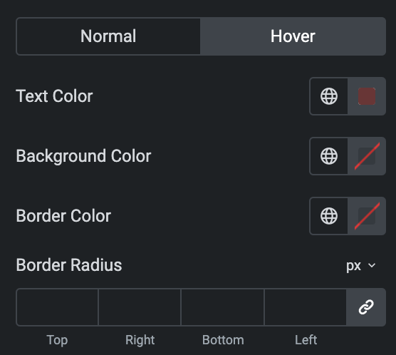
- Normal
- Text Color: Select the text color of profile text.
- Background Color: Select the background color of profile link.
- Border Type: Select the border type.
- Width: Enter the width of border.
- Color: Enter the color of border.
- Border Radius: Set the border radius.
Hover
Styling for hover state are available under this section. It will be applied when someone hovers the profile link button.
- Padding: Set the padding.
- Margin: Set the margin.
Icon
- Spacing: Set the spacing between icon and text.

Images
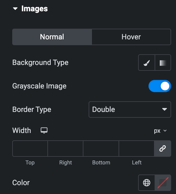
- Normal
- Background Type: Select either classic or gradient.
- GrayScale: Enable the option to display images in grayscale mode.
- Border Type: Select the border type.
- Width: Enter the width of border.
- Color: Enter the color of border.
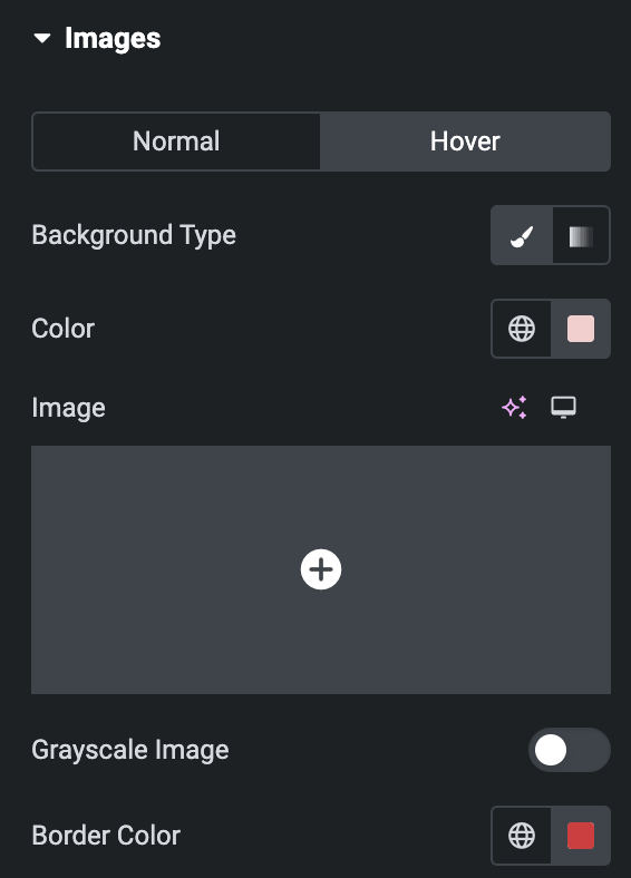
Hover
Styling for hover state are available under this section. It will be applied when someone hovers the image.
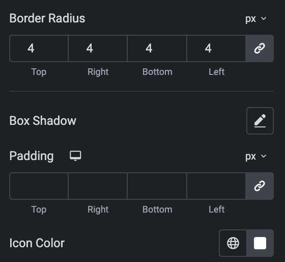
- Border Radius: Set the border radius properties.
- Box Shadow: Set the box shadow properties.
- Padding: Set the padding.
- Icon Color: Select the color for post icon(applicable if Post icon option is enabled).
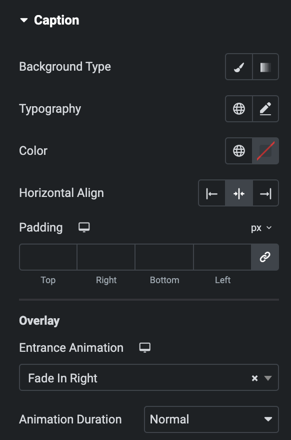
Caption
Note: This option is applicable if Show Caption option is enabled in Layout Section.
- Background Type: Select either classic or gradient.
- Typography: Set the typography.
- Color: Select the color of caption.
- Horizontal Align: Select the horizontal alignment.
- Padding: Set the padding.
Overlay
- Entrance Animation: Select the animation from available options.
- Animation Duration: Select the duration of animation.
Carousel
Note: This option is applicable if Layout is selected as Carousel.
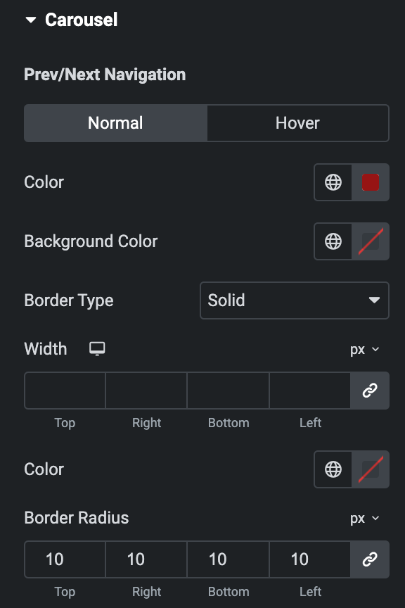
Prev/Next Navigation
- Normal
- Color: Select the color of navigation.
- Background Color: Select the background color of navigation.
- Border Type: Select the border type.
- Border Radius: Set the border radius.
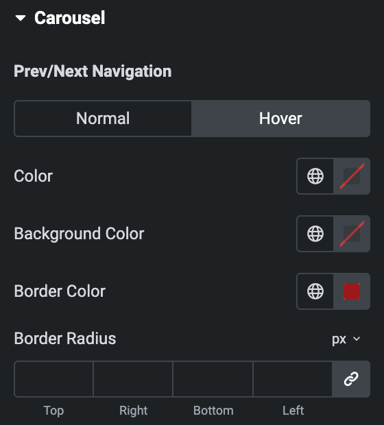
Hover
Styling for hover state are available under this section. It will be applied when someone hovers the navigation.
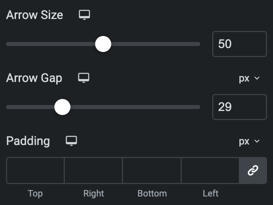
- Arrow Size: Set the size of arrow.
- Arrow Gap: Set the gap between navigation icon and post.
- Padding: Set the padding.
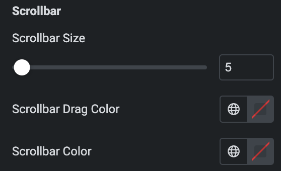
Scrollbar
Note: Only applicable when enabling Scroll bar Type in Slider Options section.
- Scrollbar Size: Set the size of scrollbar.
- Scrollbar Drag Color: Select the color for scrollbar drag.
- Scrollbar Color: Select the scrollbar color.
Note: Only applicable when selecting Pagination Type in Carousel section. Section name and features vary based on the selected Pagination Type.
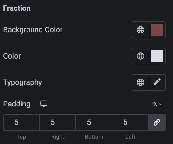
Fraction
- Background Color: Select the background color of pagination.
- Color: Select the color of pagination.
- Typography: Set the typography.
- Padding: Set the padding.
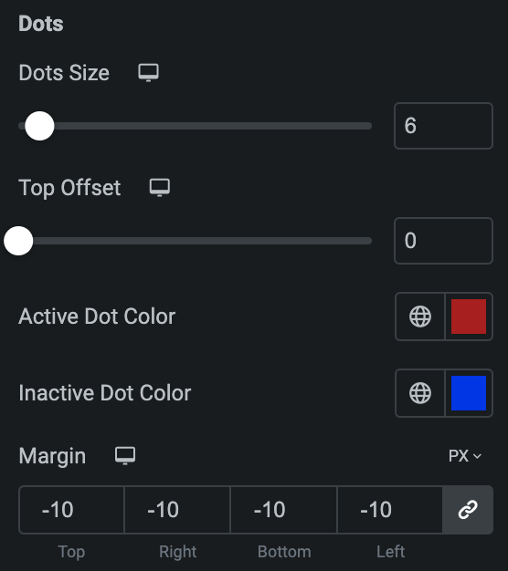
Dots
- Dot Size: Set the bullet dot size.
- Top Offset: Set the offset from the Top.
- Active Dot Color: Select the color for active state.
- Inactive Dot Color: Select the color for inactive state.
- Margin: Set the margin.
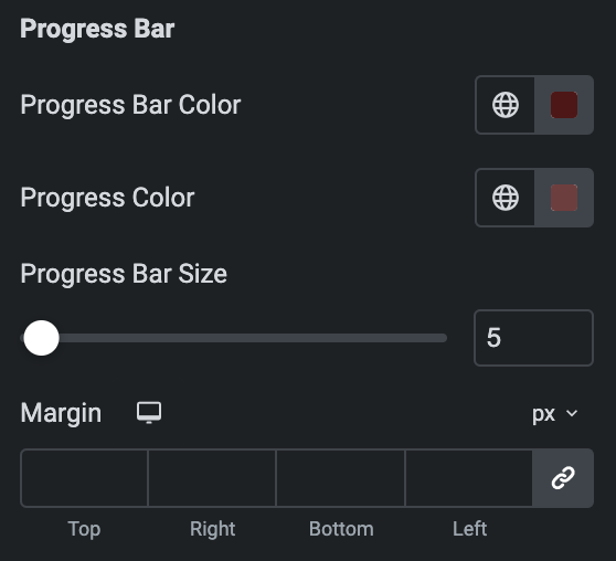
Progress Bar
- Progress Bar Color: Select the color of progress bar.
- Progress Color: Select the color of progress.
- Progress Bar Size: Enter the size of progress bar.
- Margin: Set the margin.
