
Widgets
Info Circle
EAE – Info Circle widget adds an interactive element to your website. It serves as a multipurpose widget, as you can add multiple items inside a single widget.
Content
Skins
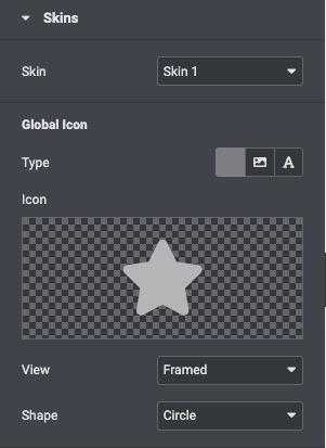
- Skin: Select the layout from the pre-build layout styles.
Global Icon
- Type: Choose the icon type like FontAwesome icon, image, or text to display.
- Icon: Select an icon from the FontAwesome library.
- Custom Icon: Upload an icon image.
- View: Choose the default icon view, or select Stacked or Framed.
- Shape: If Stacked or Framed is chosen, choose Circle or Square.
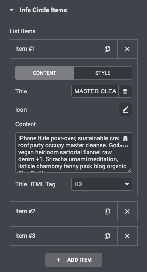
- Title: Give a title to each item of the info circle.
- Icon: To give each item of the info circle a separate icon.
- Content: Write a short description of the item.
- Title HTML Tag: Choose the HTML tag for title.
Style
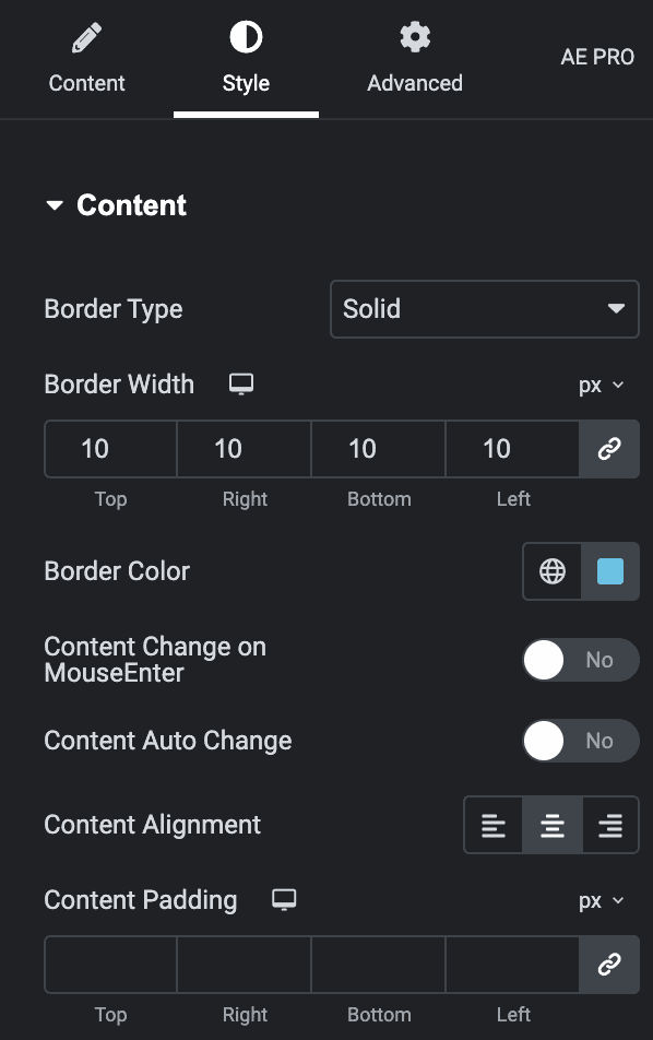
Content
- Border Type: Set a border around the content.
- Border Width: If a border type is chosen, set a width for the border.
- Border Color: Select a color for the border.
- Content change on mouse enter: Enable it to change on mouse enter.
- Content auto change: Enable it to change automatically.
- Content Alignment: Align the content Left, Center, and Right.
- Content Padding: Choose the padding for the content.
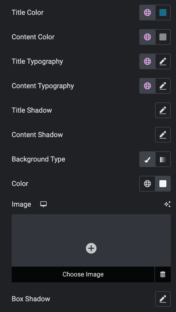
- Title Color: Choose any color for the title.
- Content Color: Choose any color for the content.
- Title Typography: Change the title typography.
- Content Typography: Set content typography.
- Background Type: Select the background type from Classic or Gradient.
- Box Shadow: Add a box shadow effect to the circle.
Icon
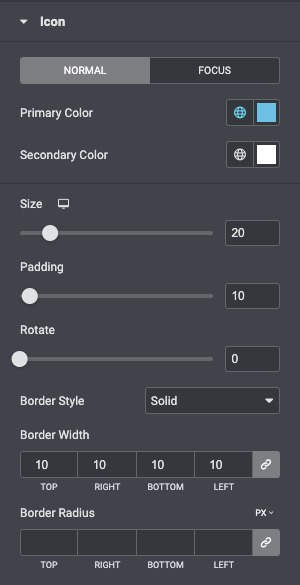
- Primary Color: Choose the primary color of the icon for both normal and active states.
- Secondary Color: Choose the secondary color of the icon for the normal and active state.
- Icon Size: Set the size of the icon.
- Padding: Set the amount of padding around the icon.
- Rotate: Select the number of degrees to rotate the icon from 0 to 360.
- Border Style: Select the type of border, choosing from none, solid, double, dotted, dashed, or grooved.
- Border Width: Set the width of the icon border.
- Border Radius: Set the radius of the icon border to control corner roundness.
