Advanced Heading
“Advanced Heading” is an incredibly powerful widget that empowers users to create visually stunning and streamlined headings for their web pages. Users can add a range of design components, such as shadow text, icons, separators, and highlighted text, to enhance the overall aesthetics of the heading.
Moreover, the widget allows users to insert icons, images, or Lottie animations between the Separator to add an extra layer of visual appeal. The widget’s easy-to-use interface makes the process of creating headings a breeze, and the result is a stunning, professional-looking heading that will surely capture the user’s attention.
The “Advanced Heading” widget features the following controls:
Content
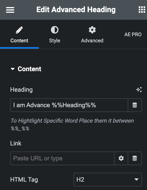
- Heading – Enter the desired text you want to display or choose the dynamic tag option. If you want to highlight specific text within the heading, place them in between %%_%%, like, Hello %%World%%.
- Link – Include a link URL in the widget by manually entering it or choosing a dynamic option.
- HTML Tag – Select the HTML tag you wish to use to display your heading.
- Icon type – Choose from a list of Icons, Images, or Lottie animations.
Icon
- Icon: Select from the Font Awesome icon library or upload an SVG image.
Image
- Image: Either upload an image or select a dynamic tag for display.
- Image size: Choose the size for your icon image display.
Lottie Animation
- Source – Choose the source of the Icon by either adding an External URL or selecting a media file.
- Loop – Enable the loop option to display the animation continuously.
- Reverse – Activate the reverse option to display the animation in reverse order.
- View – Select from default, stacked, or framed display options.
- Shape – Select either Circle or Square shape for the stack or frame.
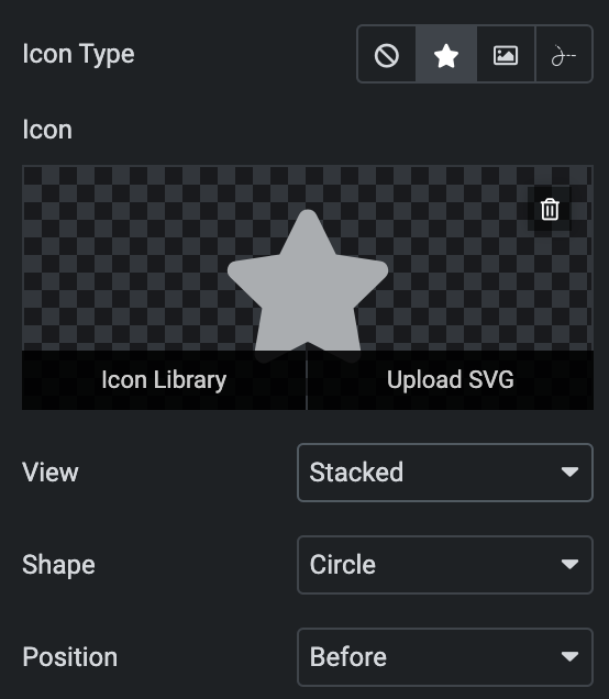
Position – Choose the position of the Icon, either before or after the heading.
Sub Heading
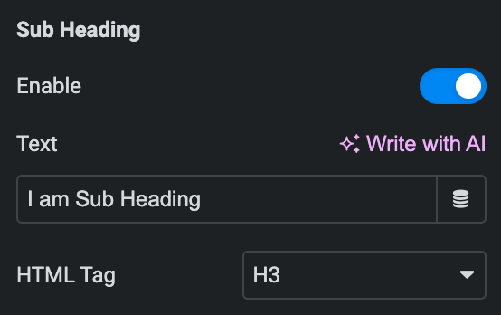
- Enable – Activate the option to add subheadings to your webpage.
- Text – Input the desired text or select a dynamic tag option for display.
- HTML Tag – Select the HTML tag you wish to use to display your sub-heading.
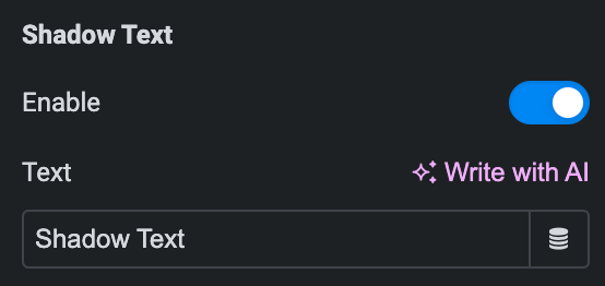
Shadow Text
- Enable – Activate the option to add shadow text to your webpage.
- Text – Input the desired text or select a dynamic tag option for display.
Icon
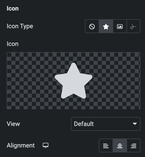
Icon Type: As we mentioned above, you can choose from a list of Icons, Images, or Lottie animations. Click here.
- Alignment: Set the alignment of icon.
Separator
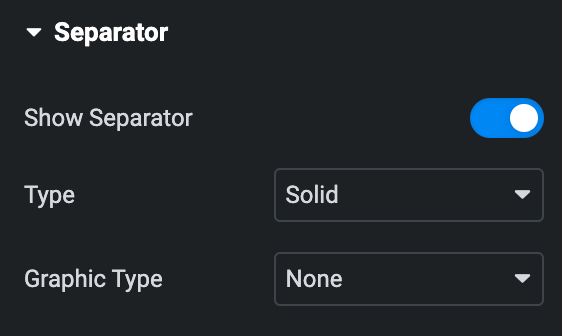
- Show Separator – Enable the option to show Separator.
- Type – Select the type of Separator.
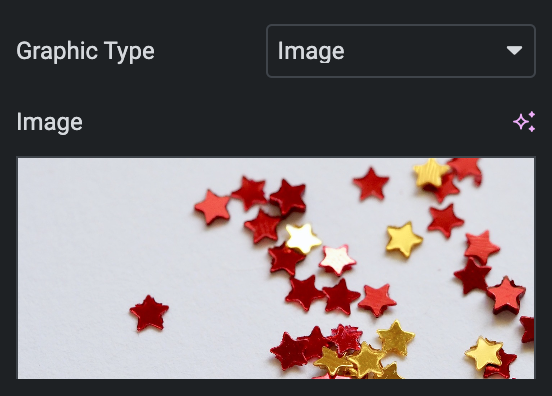
- Graphic Type – Select the graphic type for display between the separators, such as Image, Icon, or text.
Icon
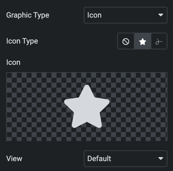
Icon type: Select either an Icon or a Lottie animation
Icon
- Icon – Select an icon from the Font Awesome library or upload an SVG
Lottie Animation
- Source – Choose the source of the Icon by either adding an External URL or selecting a media file.
- Loop – Enable the loop option to display the animation continuously.
- Reverse – Activate the reverse option to display the animation in reverse order.
- View – Select from default, stacked, or framed display options.
- Shape – Select either Circle or Square shape for the stack or frame.
Text
- Text – Enter the text that you wish to appear or use a dynamic tag between the separator.

Image
- Image – Upload an image.
- Alignment – Choose the alignment of the Separator, whether left, right, or center.
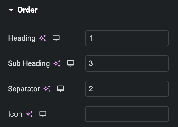
Order
Choose the order of displaying individual elements, such as
- Heading
- Subheading
- Separator
- Icon
Note: If any of these elements have a lower priority than others, they can be placed first on the webpage. This feature gives you greater control over the visual hierarchy of your webpage.
Style
Heading
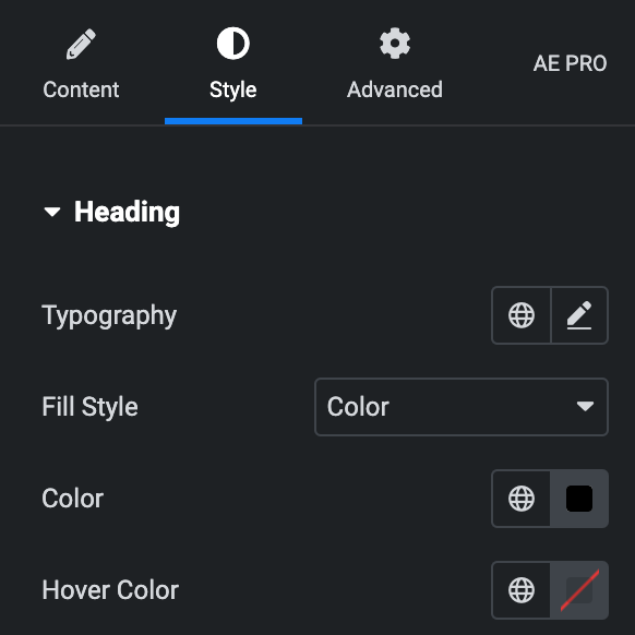
- Typography: Set the typography option for the heading.
- Fill Style: Select either a color or an image.
Color
- Color: Select the color for the background.
- Hover Color: Select the color for hover states.
Image
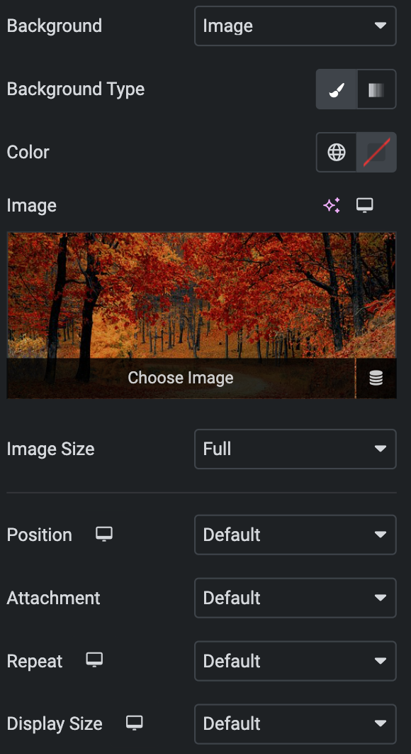
- Background Type: Choose either a Classic or a Gradient.
Classic
- Color: Choose the color for the background.
- Image: Either upload an image or select a dynamic tag for display.
- Repeat: Specify the repeat pattern for the background image.
- Display size: Choose between contain, cover, and auto options, or add custom values for the background display size.
- Image Size: Choose the size of the image, from thumbnail to full.
- Position: Set the position of the background image.
- Attachment: Choose either scroll or fixed.
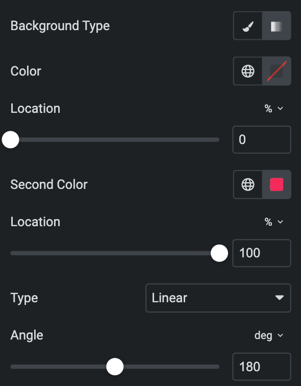
Gradient
- Color: Select the color for the background.
- Location: Determine the position of the color on the background by specifying their location in percentage.
- Second Color: Select the second color for the background.
- Location: Determine the position of the second color on the background by specifying their location in percentage.
- Type: Select either Radial or Linear.
- Radial
- Position: Set the position.
- Linear
- Angle: Set the angle using DEG, GRAD, RAD, and TURN.
- Radial
- Text Shadow: Apply a shadow to the heading if desired.
- Position: Choose the position of the heading, whether left, right, or center, for display.
- Text-align: Choose the alignment of the heading, whether left, right, or center, for display.
- Padding: Set the padding for the heading.
- Margin: Set the margin for the heading.
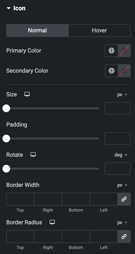
Heading Icon
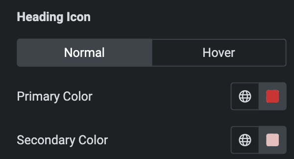
Normal
- Primary Color: Choose the primary color for the icon.
- Secondary Color: Choose the secondary color for the icon.
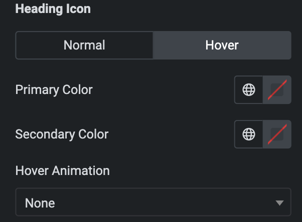
Hover
Styling controls for the hover state are available under this section. These settings will be applied when Someone hovers the icon.
- Size: Set the size of the Icon using %, EM, REM, VW, or PX.
- Padding: Set the padding for the Icon.
- Rotate: Set the rotation of your Icon in degrees.
- Border Width: Set the border’s width using %, EM, REM, VW, or PX.
- Border Radius: Set the border’s radius using PX,%, EM, or REM.
Highlighted Text
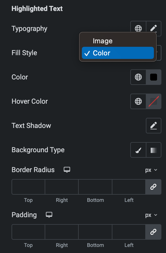
- Typography: Set the typography option for the highlighted text.
- Fill Style: As we mentioned above, you can select either a color or an image. Click here.
- Text Shadow: Apply a shadow to the highlighted text in the heading if desired.
- Background Type: As we mentioned above, you can select either Classic or Gradient. Click Here.
- Border Radius: Set the border radius.
- Padding: Set the padding.
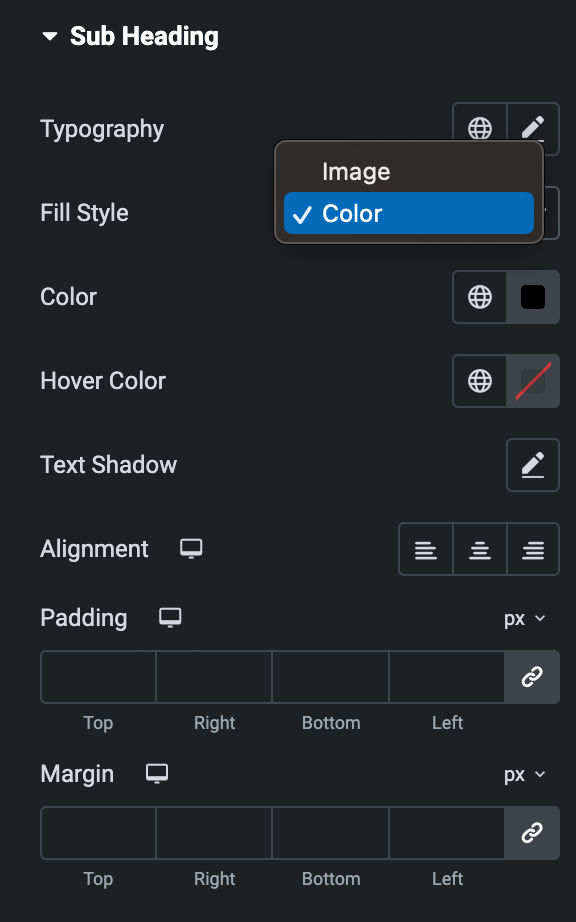
Sub Heading
- Typography: Set the typography option for the heading.
- Fill Style: As we mentioned above, you can select either a color or an image. Click here.
- Text Shadow: Apply a text shadow on the subheading.
- Alignment: Choose the desired alignment of the Icon, whether it should be on the left, right, or center
- Padding: Set the padding for the subheading.
- Margin: Set the margin for the subheading.
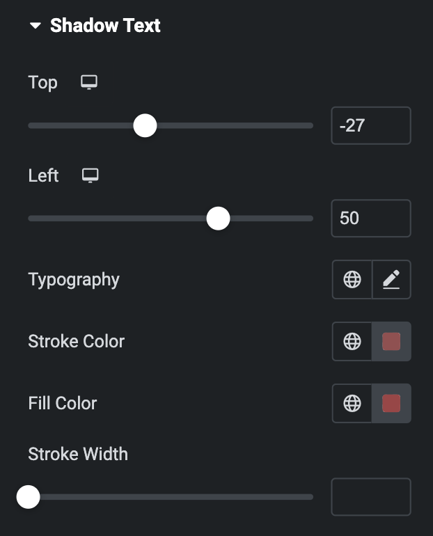
Shadow Text
- Top: Adjust the position of the shadow text from the top.
- Left: Adjust the position of the shadow text from the left.
- Typography: Set the typography for the shadow text.
- Stroke Color: Set the stroke color.
- Fill Color: Set the color to fill the text.
- Stroke Width: Set the width for the stroke on shadow text.
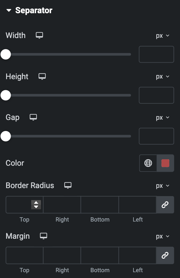
Separator
- Width: Set the width of the Separator using %, PX, EM, or REM.
- Height: Set the height of the Separator using %, PX, EM, or REM.
- Gap: Set the gap of Separator.
- Position: Set the position of Separator.
- Color: Set the color of the Separator.
- Border Radius: Set the border’s radius using PX,%.
- Margin: Set the margin for the Separator using PX, EM, or %.
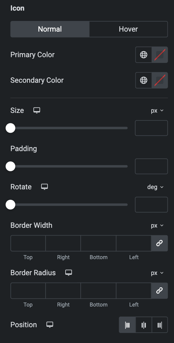
Icon
- Size: Set the size of the Icon using %, EM, REM, VW, or PX.
- Padding: Set the padding for the Icon.
- Rotate: Set the rotation of your Icon.
- Border Width: Set the border’s width using %, EM, REM, VW, or PX.
- Border Radius: Set the border’s radius using PX, %, EM, or REM.
Normal
- Primary Color: Choose the primary color for the icon.
- Secondary Color: Choose the secondary color for the icon.
Hover
Styling controls for the hover state are available under this section. These settings will be applied when Someone hovers the icon.
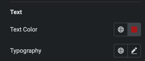
Text
Note: This is applicable when you select Text as Graphic Element in Separator.
- Text Color: Select the separator text color.
- Typography: Set the typography.
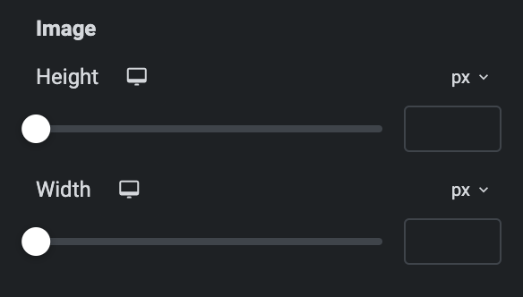
Image
Note: This is applicable when you select Image as Graphic Element in Separator.
- Height: Set the height of image.
- Width: Set the width of image.
Icon
As we mentioned above, Styling control for icons is under this section. Check here.
