Image Accordion
The “EAE Image Accordion” is a powerful widget for displaying a large amount of information in a compact and visually appealing way. By collapsing text, images, and icons into a single widget, it effectively saves screen space without sacrificing the user’s ability to access and understand the content.
Its ability to display content in a condensed, collapsed format allows for efficient use of screen real estate while maintaining high visual appeal.
The “Image Accordion” widget features the following controls:
Content
Content
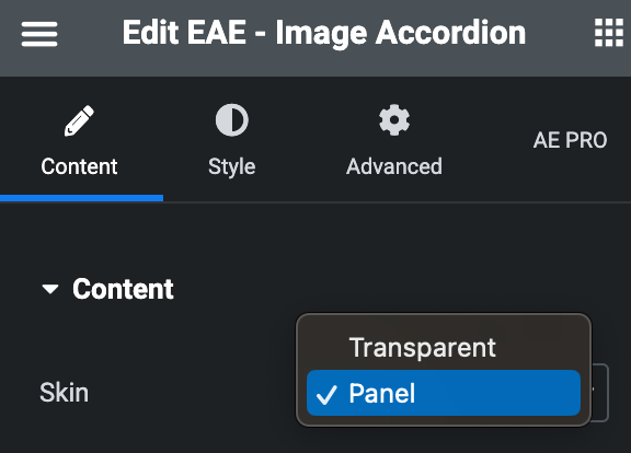
- Skin: Select the skin type, either Transparent or Panel.
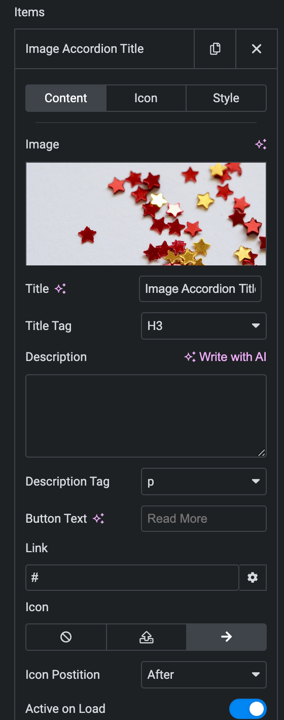
- Item
Content
- Image: Set the background image for the Image Accordion(In Transparent Skin, it will work as Overlay).
- Title: Enter the title.
- Title Tag: Select the tag for the title.
- Description: Enter the description.
- Description Tag: Select the tag for the description.
- Button Text: Enter the text for button.
- Link: Enter the URL that needs to be linked upon button.
- Icon: Select from the Font Awesome icon library or upload an SVG image.
- Icon Position: Set the position of the Icon either before or after the link text.
- Active On Load: Enable the option to display this panel upon OnLoad.
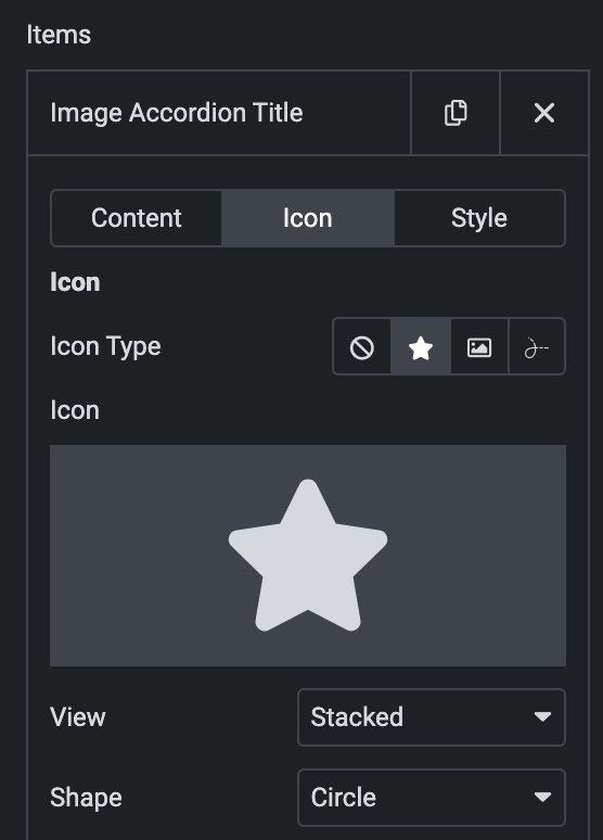
Icon
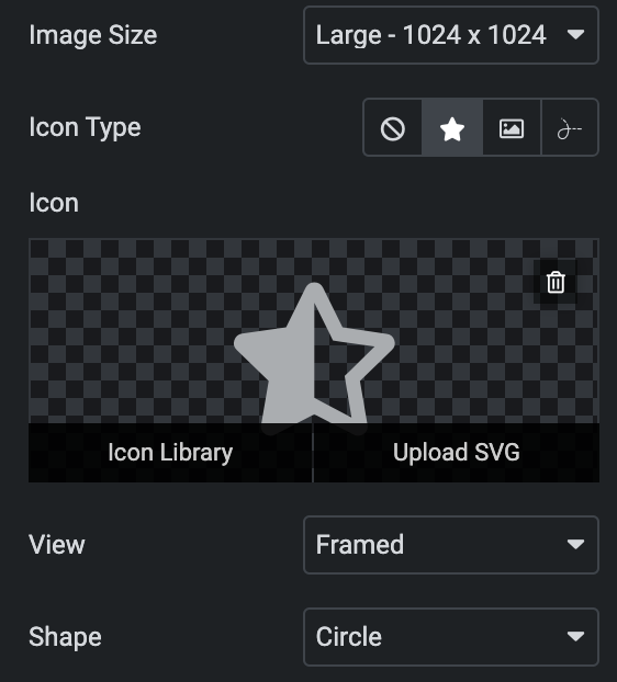
- Icon Type- Choose from a list of Icons, Images, or Lottie animations.
- Icon
- Icon: Select from the Font Awesome icon library or upload an SVG image.
- Image
- Image: Either upload an image or select a dynamic tag for display.
- Image size: Choose the size for your icon image display.
- Lottie Animation
- Source: Choose the source of the Icon by either adding an External URL or selecting a media file.
- Loop:Enable the loop option to display the animation continuously.
- Reverse: Activate the reverse option to display the animation in reverse order.
- View – Select from default, stacked, or framed display options.
- Shape– Select either Circle or Square.
- Icon
Style(for individual item)
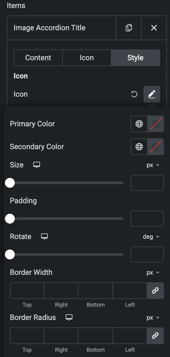
- Icon
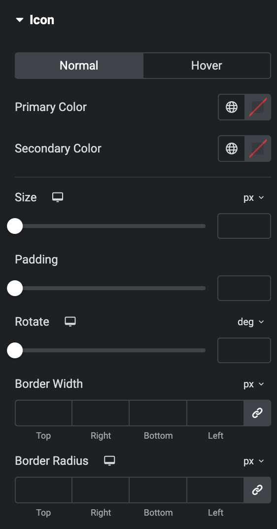
- Normal
- Primary Color: Choose the primary color for the icon.
- Secondary Color: Choose the secondary color for the icon.
- Size: Set the size of the Icon using %, EM, REM, VW, or PX.
- Padding: Set the padding.
- Rotate: Set the rotation of your Icon.
- Border Width: Set the border’s width using %, EM, REM, VW, or PX.
- Border Radius: Set the border’s radius using PX, %, EM, or REM.
- Normal
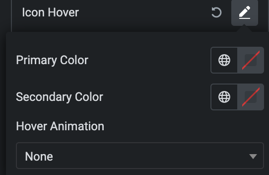
- Hover
- Styling controls for the hover state are available under this section. These settings will be applied when Someone hovers the icon.
Panel
- Background Type: Please choose between a classic or gradient background type for the panel.
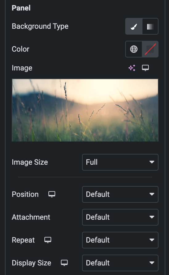
- Classic
- Color: Choose the color for the background.
- Image: Either upload an image or select a dynamic tag for display.
- Image Size: Choose the size of the image, from thumbnail to full.
- Position: Set the position of the background image.
- Attachment: Choose either scroll or fixed.
- Repeat: Specify the repeat pattern for the background image.
- Display size: Choose between contain, cover, and auto options, or add custom values for the background display size.
- Classic
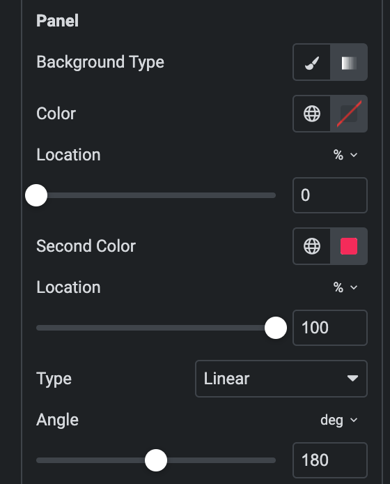
- Gradient
- Color: Select the color for the background.
- Location: Determine the position of the color on the background by specifying their location in percentage.
- Second Color: Select the second color for the background.
- Location: Determine the position of the second color on the background by specifying their location in percentage.
- Type: Select either Radial or Linear.
- Radial
- Position: Set the position.
- Linear
- Angle: Set the angle using DEG, GRAD, RAD, and TURN.
- Radial
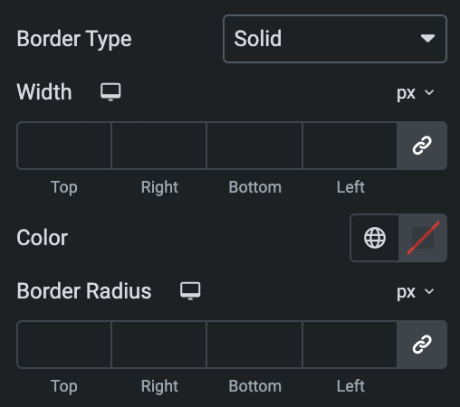
- Border Type: Select the type of border.
- Width: Enter the width for the border.
- Color: Specify the color of the border
- Border Radius: Set the border radius for a panel.
Content
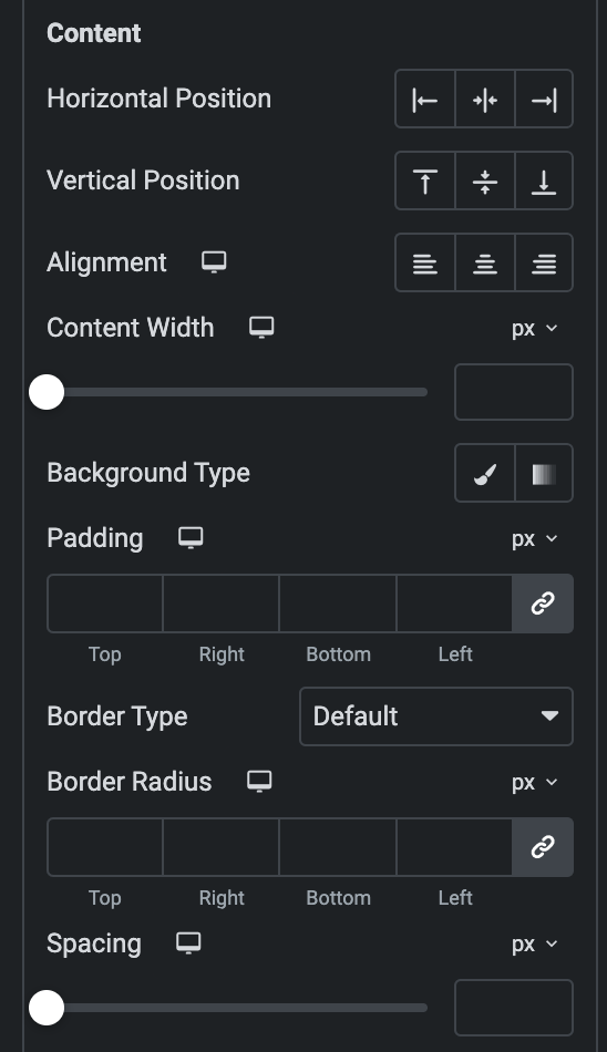
- Horizontal Position: Set the horizontal position of the content.
- Vertical Position: Set the Vertical position of the content.
- Alignment: Set the alignment
- Content Width: Specify the content width.
- Background Type: As we mentioned above, Choose between a classic or gradient background type. Click here.
- Padding: Set the padding.
- Border Type: Select the type of border.
- Width: Enter the width for the border.
- Color: Specify the color of the border
- Border Radius: Enter the border-radius.
- Spacing: Specify the gap.
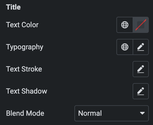
Title
- Text Color: Choose the text color of the title.
- Typography: Set the typography.
- Text Shadow: Set the text shadow for the title.
- Text Stroke: Set the text stroke.
- Blend Mode: Select the blend mode.
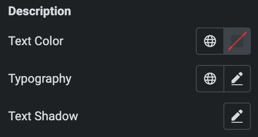
Description
- Text Color: Choose the text color of the description.
- Typography: Set the typography.
- Text Shadow: Set the text shadow for the description.
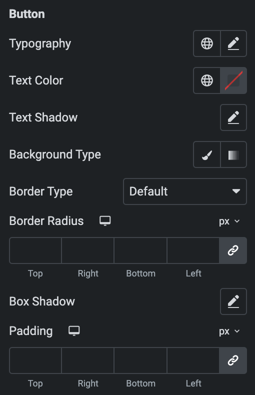
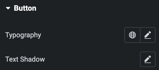
Button
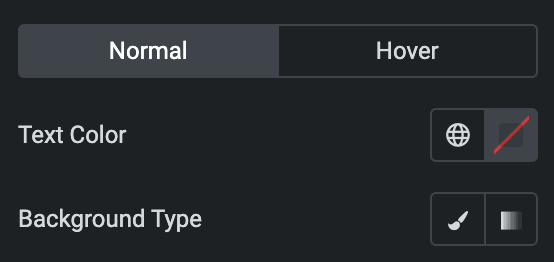
- Normal
- Typography: Set the typography.
- Text Color: Choose the text color of the Button.
- Text Shadow: Set the text shadow for the Button.
- Background Type: As we mentioned above, Choose between a classic or gradient background type for the button. Click here.
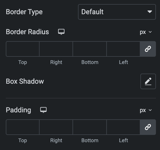
- Border Type: Select the type of border.
- Width: Enter the width for the border.
- Color: Specify the color of the border
- Border Radius: Set the border-radius.
- Box Shadow: Set the box shadow.
- Padding: Set the padding.
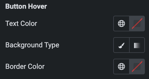
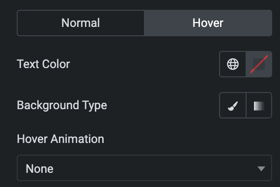
- Button Hover
- Styling controls for the hover state are available under this section. These settings will be applied when Someone hovers the button.
- Image Size: Set the size of an image.
- Icon Type: As we mentioned above, Choose from a list of Icons, Images, or Lottie animations. Click here.
Settings
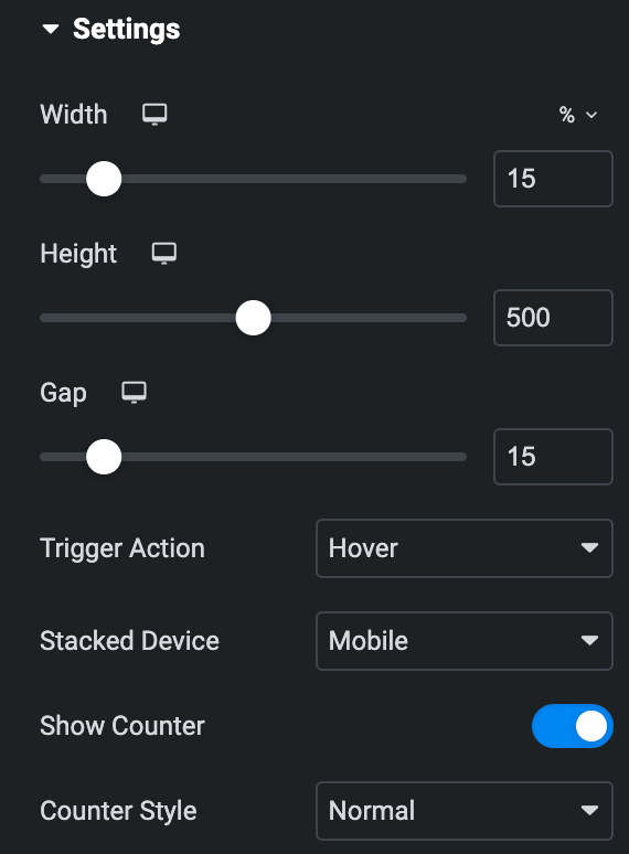
- Width: Set the width of Image accordion items.
- Height: Set the height of Image accordion items.
- Gap: Specify the gap between the accordion items(applicable when Panel is selected as Skin).
- Trigger Action: Select trigger action either hover or click.
- Stacked Device: Choose a stacked device, either a phone or tablet.
- Show Counter: Enable the option if desired.
- Counter Style: Specify the counter style.
Style
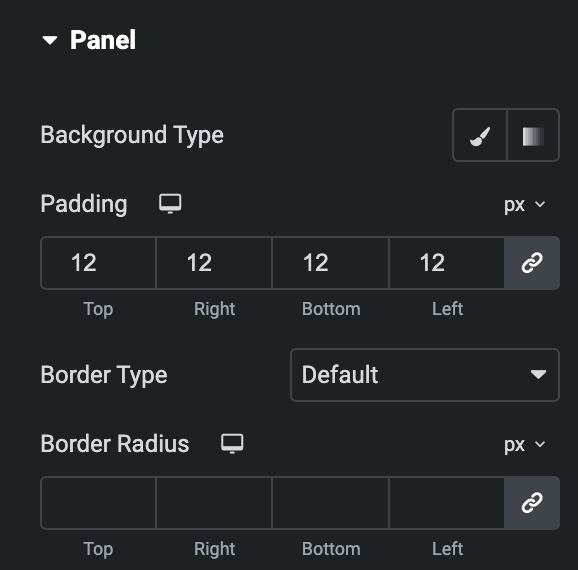
Panel
- Background Type: As we mentioned above, Choose between a classic or gradient background type for the panel. Click here.
- Padding: Set the padding.
- Border Type: Select the type of border.
- Width: Enter the width for the border.
- Color: Specify the color of the border
- Border Radius: Set the border’s radius using PX, %, EM, or REM.
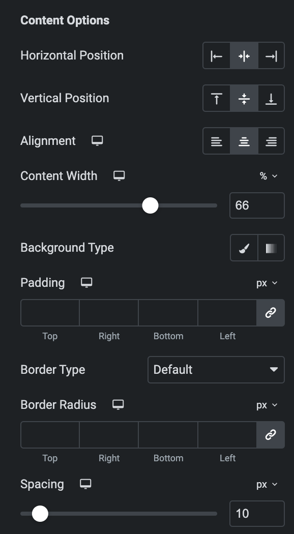
Content Options
- Horizontal Position: Set the horizontal position of the content.
- Vertical Position: Set the Vertical position of the content.
- Alignment: Set the alignment
- Content Width: Specify the content width.
- Background Type: Choose between a classic or gradient background type. Click here.
- Padding: Set the padding.
- Border Type: Select the type of border.
- Width: Enter the width for the border.
- Color: Specify the color of the border
- Border Radius: Enter the border-radius.
- Spacing: Specify the gap.
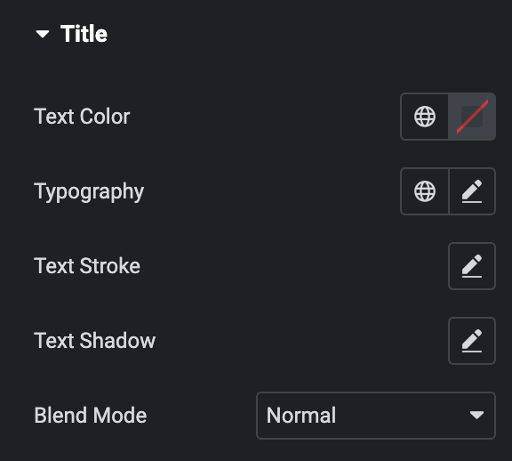
Title
- Text Color: Choose the text color of the title.
- Typography: Set the typography.
- Text Shadow: Set the text shadow for the title.
- Text Stroke: Set the text stroke.
- Blend Mode: Select the blend mode.
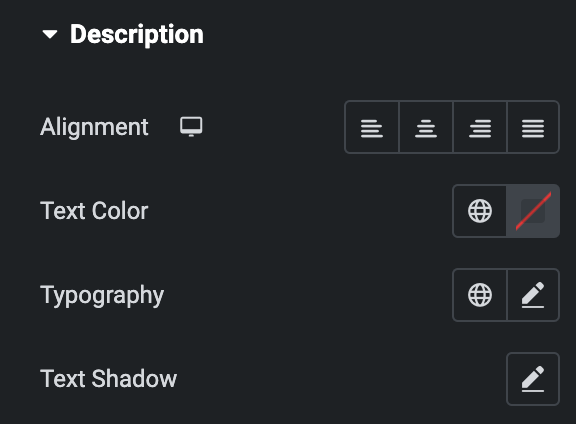
Description
- Alignment: Set the alignment of the description.
- Text Color: Choose the text color of the description.
- Typography: Set the typography.
- Text Shadow: Set the text shadow for the description.
Button
- Typography: Set the typography.
- Text Shadow: Set the text shadow for the button
- Normal
- Text Color: Choose the text color of the Button.
- Background Type: Choose between a classic or gradient background type for the button. Click here.
- Hover
- Styling controls for the hover state are available under this section. These settings will be applied when Someone hovers the button.
- Border Type: Select the type of border.
- Width: Enter the width for the border.
- Color: Specify the color of the border
- Border Radius: Set the border’s radius using PX, %, EM, or REM.
- Box Shadow: Set the box shadow.
- Padding: Set the padding.
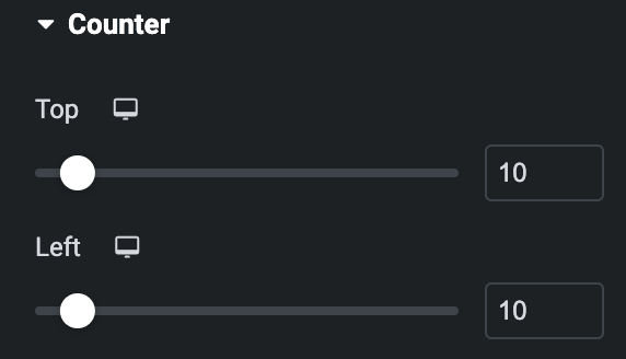
Counter
Note: This is applicable when Show Counter is enabled in Setting section.
- Top: Adjust the position of the counter from the top.
- Left: Adjust the position of the counter from the top.
- Normal
- Color: Set the color of the counter text.
- Typography: Set the typography.
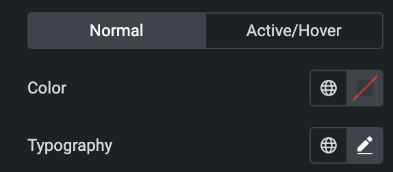
- Active/Hover
- Color: Set the color of text for counter Active/Hover.
Icon
Styling controls for the hover and normal state are available under this section. Hover settings will be applied when Someone hovers the icon. Click here.