Business Hours
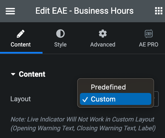
The “EAE – Business Hours” widget is a useful tool for companies to manage and communicate their daily operating hours efficiently. It offers two layouts: Predefined and Custom.
When selecting predefined timing, you can utilize the live business indicator feature, which allows you to display personalized opening and closing messages and real-time updates on the businesses status, whether it is currently opened or closed.
Additionally, it showcase live timing, keeping your clients well-informed and up-to-date with your company’s schedule.
The Business Hours widget features the following controls:
Content
Content
- Layout: Select from either predefined or custom. Predefined option have pre-set days, while the Custom option allows you to manage days according to your needs.
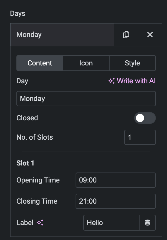
- Days: Add the days using Add Item button(applicable for Custom Layout).
Content
- Day: Enter the text of the Day.
- Closed: Enable the option, if needed.
- Closed Text: Enter the text.
- No. of Slots: Enter the number of slots available.
- Opening Time: Set the opening time.
- Closing Time: Set the closing time.
- Label: Enter the label, if any.
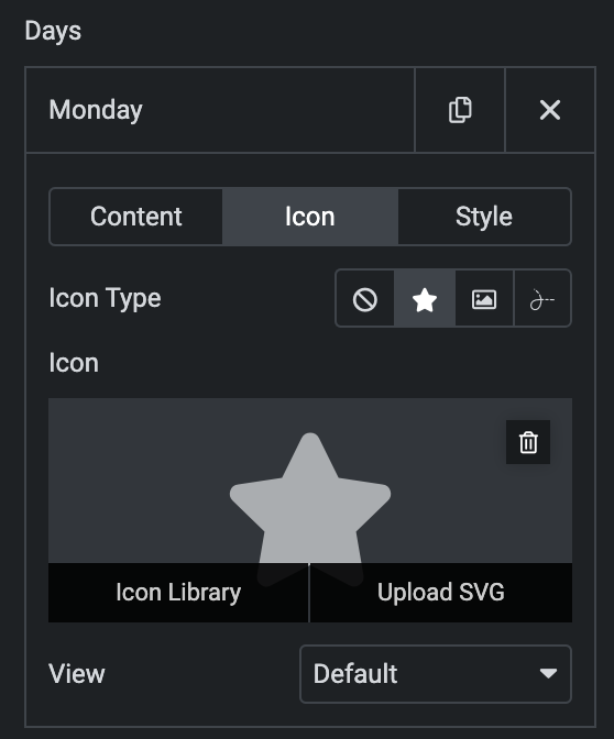
Icon
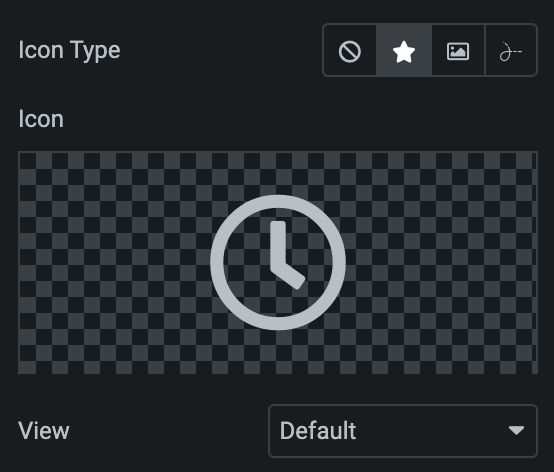
- Icon Type: Choose from a list of Icons, Images, or Lottie animations.
- Icon
- Icon: Select from the Font Awesome icon library or upload an SVG image.
- Image
- Image: Either upload an image or select a dynamic tag for display.
- Image size: Choose the size for your icon image display.
- Lottie Animation
- Source: Choose the source of the Icon by either adding an External URL or selecting a media file.
- Loop: Enable the loop option to display the animation continuously.
- Reverse: Activate the reverse option to display the animation in reverse order.
- Icon
- View: Select from default, stacked, or framed display options.
- Shape: Select either Circle or Square shape for the stack or frame.
Style(for individual day)
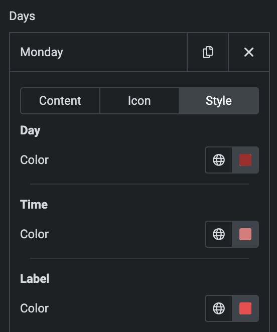
Day
- Color: Select the color.
Time
- Color: Select the color for time slot.
Label
- Color: Select the color for label.
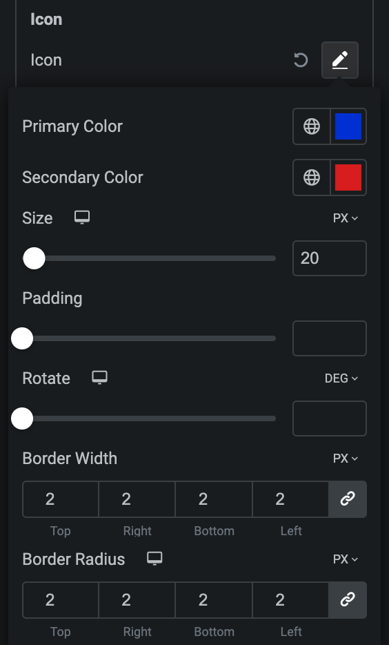
Icon
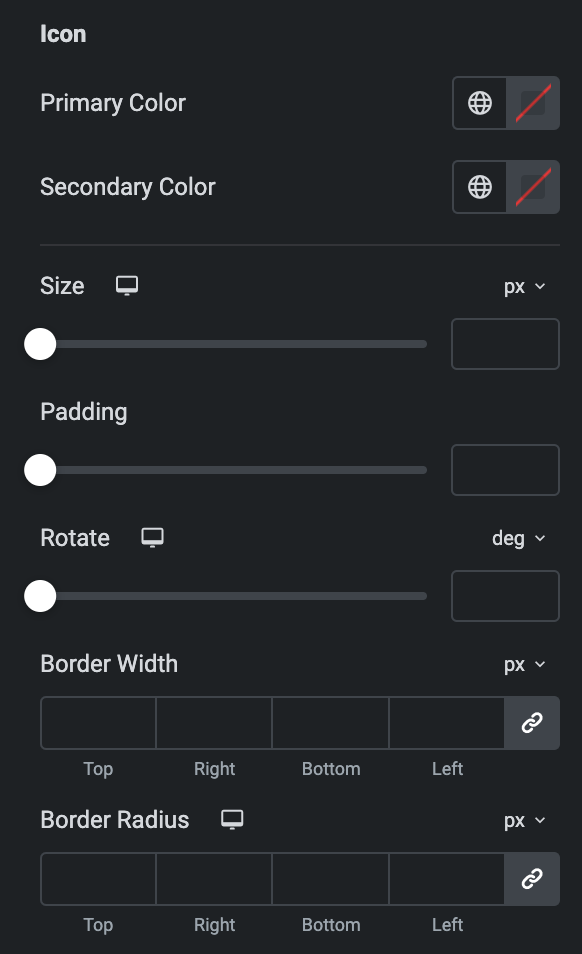
- Primary Color: Choose the primary color for the icon.
- Secondary Color: Choose the secondary color for the icon.
- Size: Set the size of the Icon using %, EM, REM, VW, or PX.
- Padding: Set the padding for the Icon.
- Rotate: Set the rotation of your Icon in degrees.
- Border Width: Set the border’s width.
- Border Radius: Set the border’s radius.
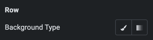
Row
- Background Type: Choose either a Classic or a Gradient.
- Classic
- Color: Choose the color for the background.
- Image: Either upload an image or select a dynamic tag for display.
- Image Size: Choose the size of the image, from thumbnail to full.
- Position: Set the position of the background image.
- Attachment: Choose either scroll or fixed.
- Repeat: Specify the repeat pattern for the background image.
- Display size: Choose between contain, cover, and auto options, or add custom values for the background display size.
- Gradient
- Color: Select the color for the background.
- Location: Determine the position of the color on the background by specifying their location in percentage.
- Second Color: Select the second color for the background.
- Location: Determine the position of the second color on the background by specifying their location in percentage.
- Type: Select either Radial or Linear.
- Radial
- Position: Set the position.
- Linear
- Angle: Set the angle using DEG, GRAD, RAD, and TURN.
- Radial
- Classic
- Icon Type: As we mentioned above, Choose from a list of Icons, Images, or Lottie animations. Click here.
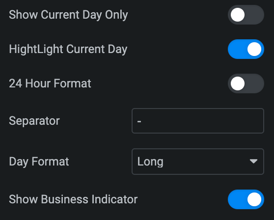
- Show Current Day Only: Enable the option to show only current day.
- Highlight Current Day: Enable the option to highlight current day.
- 24 Hour Format: Enable the option to display time in the 24-hour format.
- Separator: Specify the Separator for displaying between slot times.
- Day Format: Choose either Long or Short.
- Show Business Indicator: Enable the option if needed.
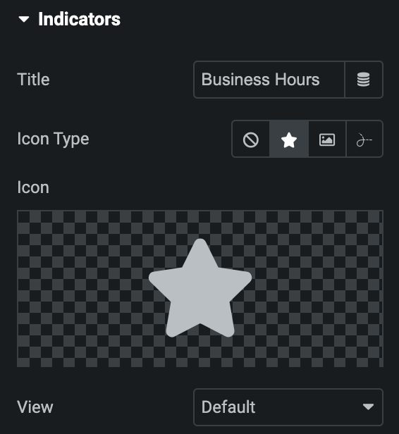
Indicators
Note: This option is applicable when Show Business Indicator option is enabled in Content Section.
- Title: Enter the title for Business Indicator.
- Icon Type: As we mentioned above, Choose from a list of Icons, Images, or Lottie animations. Click here.
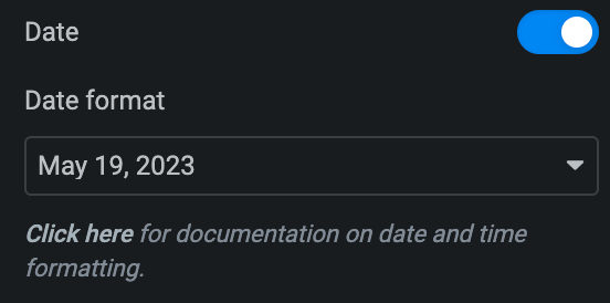
- Date: Enable the option if needed.
- Date Format: Select the date format from the list or enter a custom date.
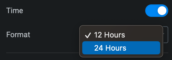
- Time: Enable the option if wanted.
- Format: Select from either 12 hours or 24 hours.
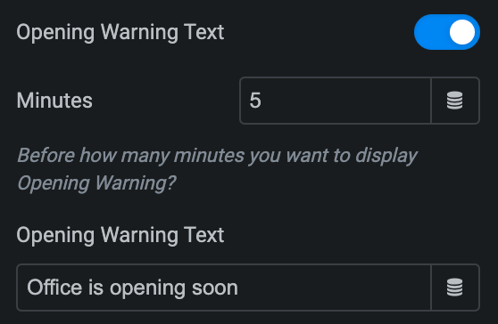
- Opening Warning Text: Enable the option to display open warning text.
- Minutes: Specify, How many minutes before message will display.
- Opening Warning Text: Enter the warning text.
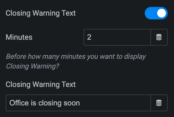
- Closing Warning Text: Enable the option to display closing warning text.
- Minutes: Specify, How many minutes before message will display.
- Closing Warning Text: Enter the warning text.
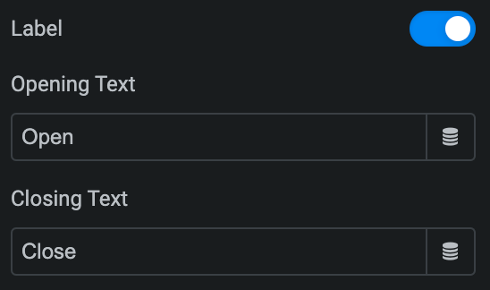
- Label: Enable the option if desired.
- Opening Text: Enter the text for opened label.
- Closing Text: Enter the text for the closed label.
Style
Content
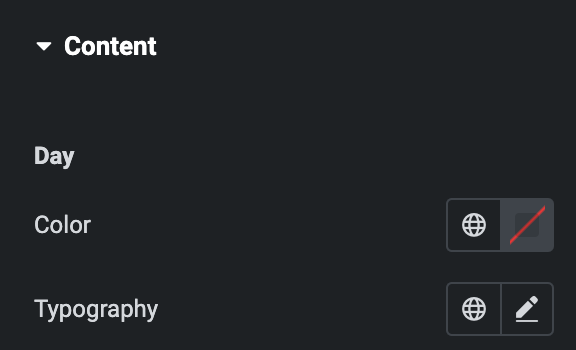
Day
- Color: Select the color of day.
- Typography: Set the typography.
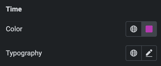
Time
- Color: Select the color of Time.
- Typography: Set the typography.
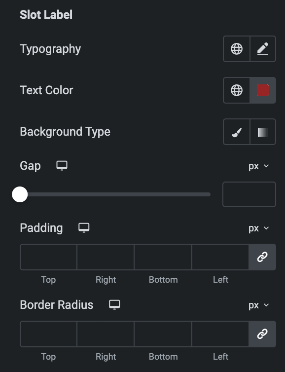
Slot Label
- Typography: Set the typography of label.
- Text Color: Set the text color of label.
- Background Type: As we mentioned above, Select either classic or gradient. Click here.
- Gap: Set the label gap from time.
- Padding: Set the padding.
- Border Radius: Set border radius.
Icon
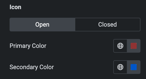
Open
- Primary Color: Choose the primary color for the icon.
- Secondary Color: Choose the secondary color for the icon.
Closed
Styling controls for the closed row icon are available under this section. These settings will be applied when Someone closed any row.
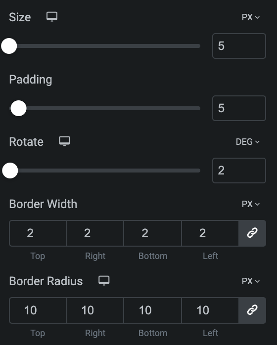
- Size: Set the size of the Icon using %, EM, REM, VW, or PX.
- Padding: Set the padding for the Icon.
- Rotate: Set the rotation of your Icon in degrees.
- Border Width: Set the border’s width.
- Border Radius: Set the border’s radius.
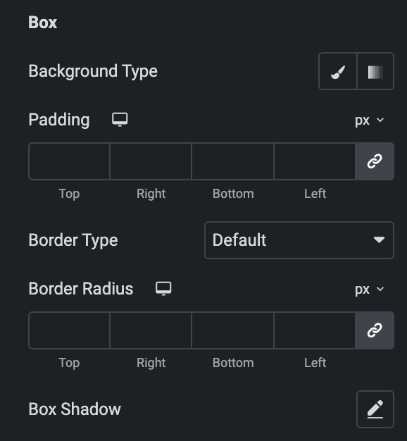
Box
- Background Type: Select either from classic or gradient. Click here.
- Padding: Set the padding.
- Border Type: Set the border properties.
- Width: Set the width of border.
- Color: Select the color of border.
- Border Radius: Set border radius properties.
- Box Shadow: Set the box shadow.
Row Style
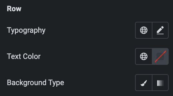
Row
- Typography: Set the typography of row.
- Text Color: Select the text color.
- Background Type: Select either Classic or Gradient. Click here.
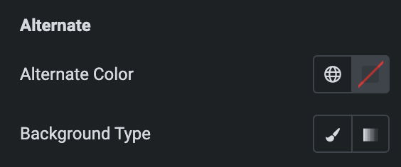
Alternate
- Alternate Color: Select the color for alternate row.
- Background Type: Select either Classic or Gradient. Click here.
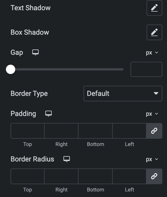
- Text Shadow: Set the text shadow.
- Box Shadow:Set the box shadow on row.
- Gap: Specify the gap between the rows.
- Border Type: Set the border.
- Padding: Set the padding.
- Border Radius: Set the border radius.
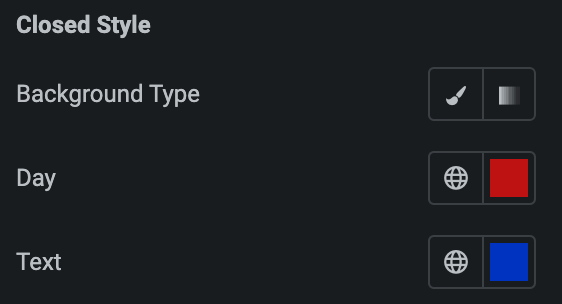
Closed Style
- Background Type: As we mentioned above, Select either classic or gradient. Click here.
- Day: Select the color of closed day.
- Text: Select the color of closed text.
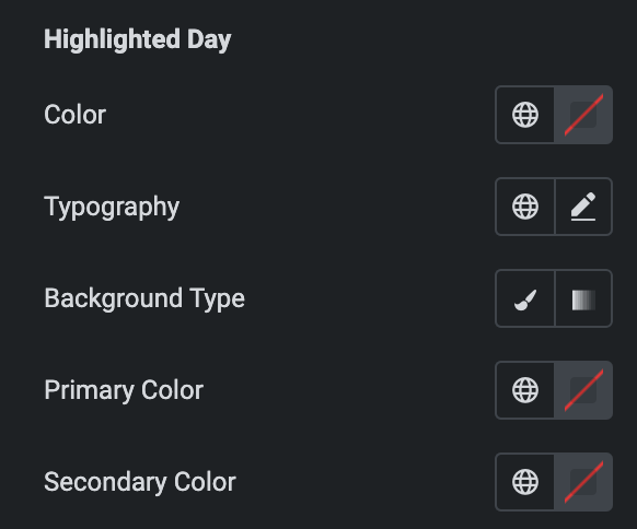
Highlighted Day
Note: This option is applicable when Highlight Current Day Option is enabled in Content section.
- Color: Select the color of highlight day.
- Typography: Set the typography.
- Background Type: As we mentioned above, Select either from classic or gradient. Click here.
- Primary Color: Choose the primary color.
- Secondary Color: Choose the secondary color.
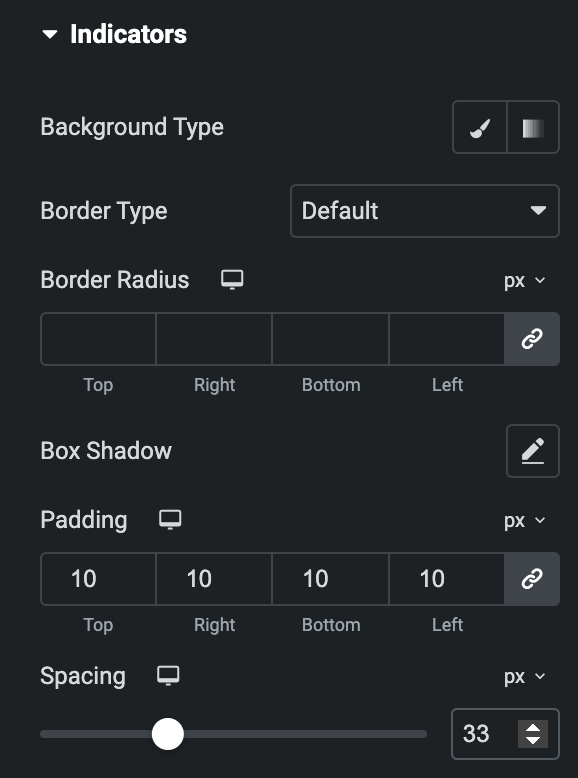
Indicators
Note: This option is applicable when the Show Business Indicator option is enabled in Content Section.
- Background Type: As we mentioned above, Select either classic or gradient. Click here.
- Border Type: Select the border type.
- Border Radius: Set the border radius.
- Box Shadow: Set the box shadow properties.
- Padding: Set the padding.
- Spacing: Specify the spacing.
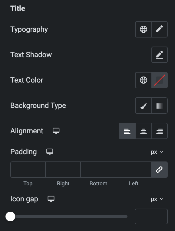
Title
- Typography: Set the typography.
- Text Shadow: Set the text shadow properties.
- Text Color: Select the color of title.
- Background Type: Select either from classic or gradient. Click here.
- Alignment: Set the alignment of title.
- Padding: Set the padding.
- Icon Gap: Set the gap of icon from title.
Icon
- Primary Color: Choose the primary color for the icon.
- Secondary Color: Choose the secondary color for the icon.
- Size: Set the size of the Icon using %, EM, REM, VW, or PX.
- Padding: Set the padding for the Icon.
- Rotate: Set the rotation of your Icon in degrees.
- Border Width: Set the border’s width.
- Border Radius: Set the border’s radius.
Date
Note: This option is applicable if Date option is enable in Indicators section.
- Typography: Set the typography of date.
- Text Shadow: Set the text shadow.
- Text Color: Select the text color of date.
- Background Type: Select from classic or gradient. Click here.
- Alignment: Select from Left, Center, or Right.
- Padding: Set the padding.

Time
Note: This option is applicable if Time option is enabled in Indicators section.
- Typography: Set the typography of date.
- Text Shadow: Set the text shadow.
- Text Color: Select the color of text.
- Background Type: Select either from classic or gradient. Click here.
- Alignment: Select from Left, Center, or Right.
- Padding: Set the padding.
Label
Note: This option is applicable when Label option is enabled in Indicators section.
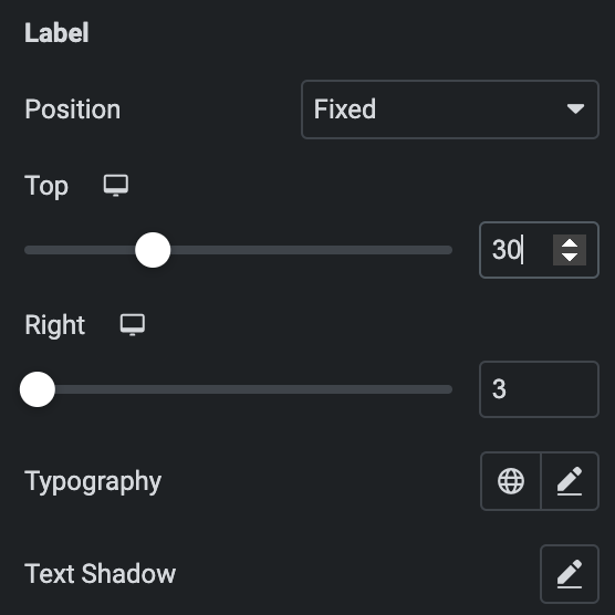
- Position: Select either Fixed or Relative.
- Top: Set the spacing from top(applicable if Fixed position is selected).
- Right: Set the spacing from right(applicable if Fixed position is selected).
- Typography: Set the typography of label.
- Text Shadow: Set the text shadow.
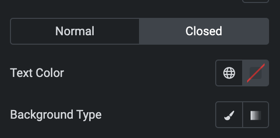
Normal
- Text Color: Select the color of text.
- Background Type: Select either from classic or gradient. Click here.
Closed
Styling controls for the closed day label are available under this section. These settings will be applied when someone puts a label on closed day.
- Padding: Set the padding.
- Border Type: Select the border type.
- Border Radius: Set the border radius.
- Box Shadow: Set the box shadow properties.
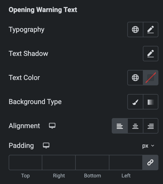
Opening Warning Text
Note: This option is applicable when Opening Warning Text option is enabled in Indicators section.
- Typography: Set the typography of date.
- Text Shadow: Set the text shadow.
- Text Color: Select the color of text.
- Background Type: Select either from classic or gradient. Click here.
- Alignment: Select from Left, Center, or Right.
- Padding: Set the padding.
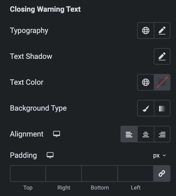
Closing Warning Text
Note: This option is applicable when Closing Warning Text option is enabled in Indicators section.
- Typography: Set the typography of date.
- Text Shadow: Set the text shadow.
- Text Color: Select the color of text.
- Background Type: Select either from classic or gradient. Click here.
- Alignment: Select from Left, Center, or Right.
- Padding: Set the padding.
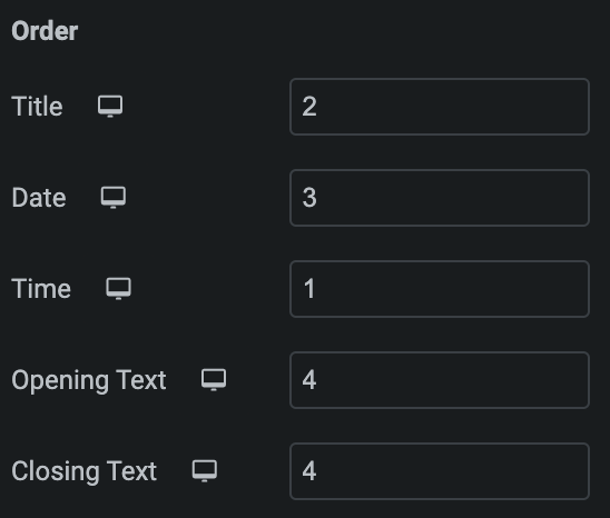
Order
Choose the order of displaying individual elements, such as
- Title
- Date
- Time
- Opening Text
- Closing Text
Note: If any of these elements have a lower priority than others, they can be placed first on the Business Indicator box. This feature gives you greater control over the visual hierarchy of your webpage.
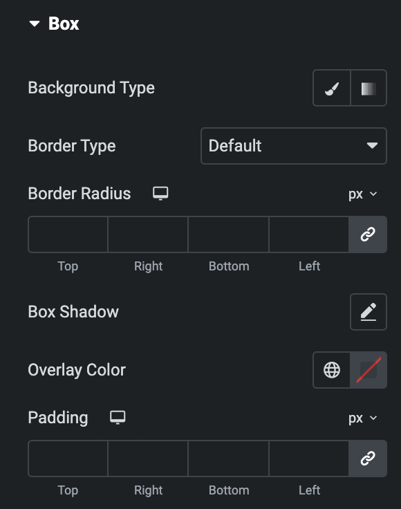
Box
- Background Type: Select either from classic or gradient. Click here.
- Border Type: Select the border type.
- Border Radius: Set border radius properties.
- Box Shadow: Set the box shadow.
- Overlay Color: Select the overlay color of box.
- Padding: Set the padding.