
Widgets
Comparison Table
EAE-comparison Table is an effective way to display your product features. This widget makes it easy for the customers to compare various products and thus make decisions.
Content
General
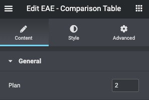
Plan: Enter the number of Product tables you want to display.
Feature box
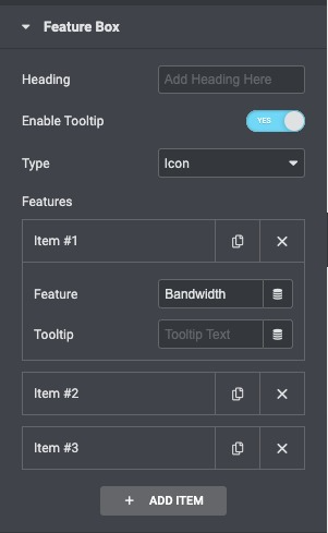
- Heading: Enter the title for the feature box content.
- Enable Tooltip: Enable or disable the tooltip.
- Type: Select the tooltip type like Link or the Icon.
- Features: Enter the list of all the features you are offering. Click on the Add Item button to add another item to the list.
Plan
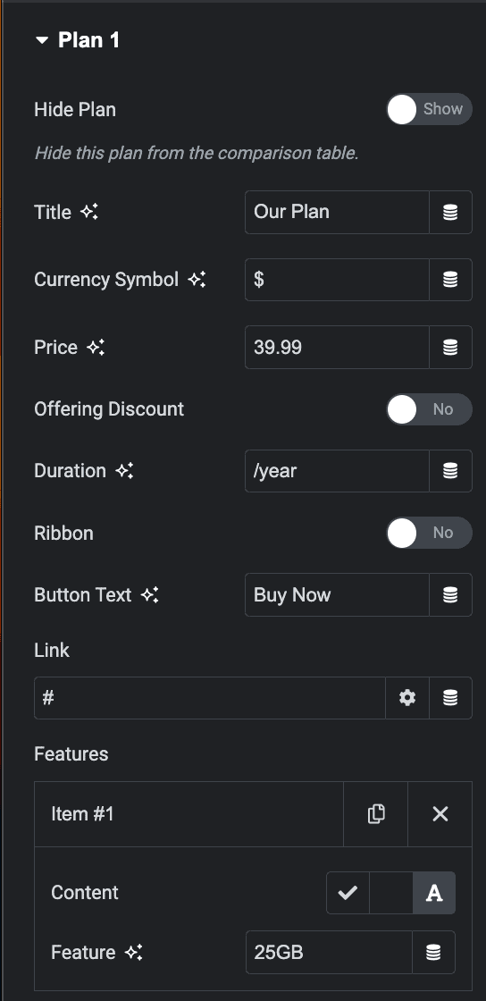
- Hide Plan: Enable the option to hide the individual plan from table.
- Title: Enter the title of the specific price plan
- Currency Symbol: Give a custom currency symbol.
- Price: Set the pricing of your product.
- Offering Discount: Enable it if you want to display the discounted price.
- Duration: Enter the period for each payment that appears under the price.
- Ribbon: Enable or disable the corner ribbon.
- Ribbon Text: Enter the text to be displayed on the ribbon
- Position: Display the ribbon on the Top, Left, and Right of the table
- Button text: Write the text that will appear for the button
- Link: Enter the URL for the item’s link. Click the setting icon to either add nofollow to the link or to open the link in a new window
- Feature: Add a list of all the features you offer for the particular product.
- Content: Enable the option to enter the feature.
- Feature: Specify the feature.
- Content: Enable the option to enter the feature.
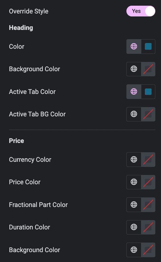
- Override Styles: Enable this option to style a particular plan. It contains option for styling(Heading, Price, Features, Button).
Button
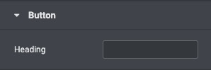
- Heading: Assign a title to the Call to Action row.
Settings
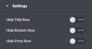
- Hide Title Row: Enable to hide titles of the plans.
- Hide Bottom Row: Enable to hide the bottom row of the plan.
- Hide Price Row: Enable to hide the price row for plans.
Style
General
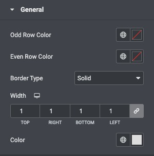
- Odd Row Color: Choose a background color for the odd row.
- Even Row Color: Choose a background color for the even row.
- Border Type: Select the border type from none, solid, double, dotted, dashed, or grooved.
- Width: Set the thickness of the border.
- Color: Select the border color.
Feature box
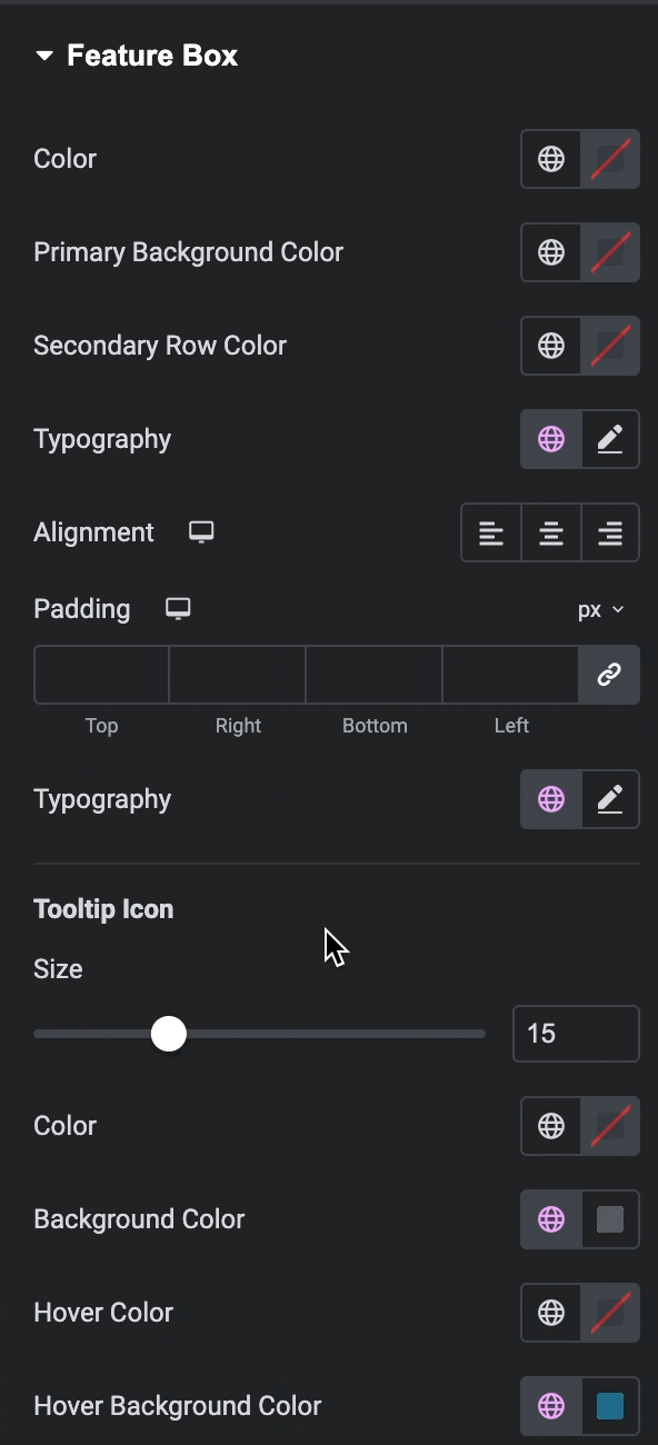
- Color: Set the color for the feature box text.
- Primary Background Color: Choose a primary background color.
- Secondary Row Color: Choose Secondary Color.
- Typography: Set the typography options for the feature box text.
- Alignment: Align the text to the right, left, or center.
Tooltip Icon
- Size: Set the size of the tooltip icon.
- Color: Set the color for the Tooltip icon.
- Background Color: Choose a background color for the tooltip icon.
- Hover Color: Set the color for the Tooltip icon.
- Hover Background Color: Choose a background color for the tooltip on hover.
Tooltip Text
- Size: Set the size of the tooltip text.
- Color: Set the color for the Tooltip text.
- Background Color: Choose a background color for the tooltip.
- Hover Color: Set the color for the Tooltip text.
- Hover Background Color: Choose a background color for the tooltip on hover.
Ribbon
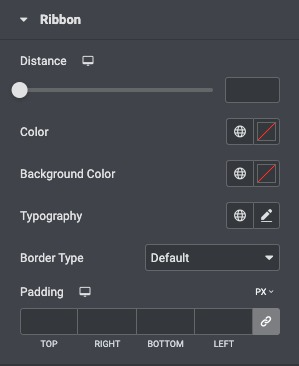
- Distance: Control the distance between the ribbon and the corner
- Color: Set the color for the Ribbon.
- Background Color: Choose the background color of the ribbon
- Typography: Set the typography options for the ribbon’s text
- Border Type: Select the border type from none, solid, double, dotted, dashed, or grooved
Heading
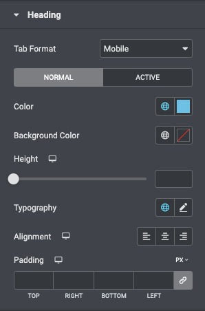
- Tab Format: choose from the list of Formats available.
- Active Tab Color: Set the background color for the active heading tab.
- Color: Set the heading text color.
- Active Tab Text Color: Set the text color for the active heading.
- Background Color: Choose the background color of the header row.
- Height: Adjust the height of the header row.
- Typography: Set the typography options for the heading text.
- Alignment: Align the heading to the right, left, or center.
Price
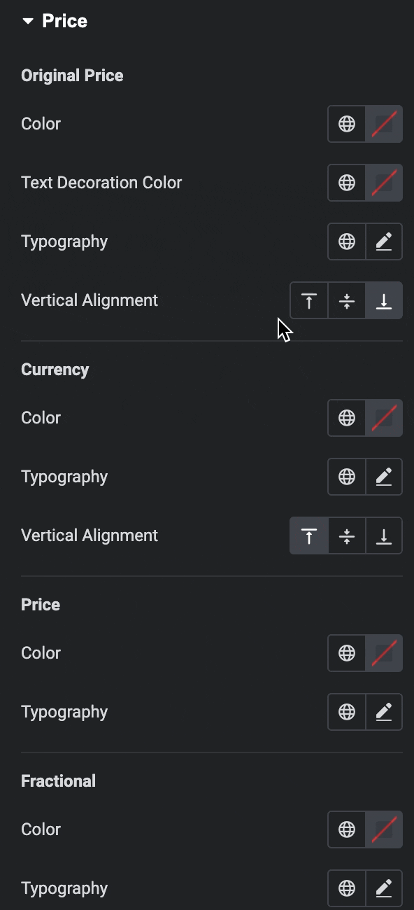
Original Price
- Color: Choose the color of the price.
- Text decoration Color: Choose the text decoration color of the price.
- Typography: Set the typography options for the pricing area.
Currency
- Color: Set the color of the currency symbol.
- Typography: Set the typography options for the currency.
- Vertical Alignment: Set the currency symbol to display at the price’s top, middle, or bottom.
Price
- Color: Choose the color of the price.
- Typography: Set the typography options for the pricing area.
Fractional
- Color: Choose the color of the fractional part.
- Typography: Set the typography options for the fractional part.
Duration
- Color: Choose the color of the duration text.
- Typography: Set the typography options for the duration text.
- Background Color: Choose a background color for the pricing area.
- Alignment: Set the alignment of the duration.
Features
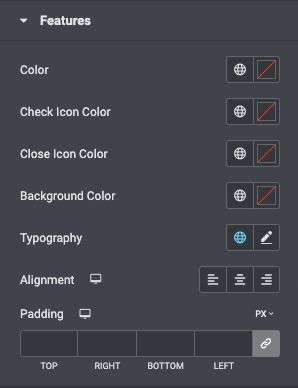
- Color: Choose the color of the features list text.
- Check Icon Color: Choose the icon color.
- Close Icon Color: Choose the close icon color.
- Typography: Set the typography options for the features list text.
- Alignment: Align the list to the right, left, or center.
- Padding: Customize the padding of the features list.
Button
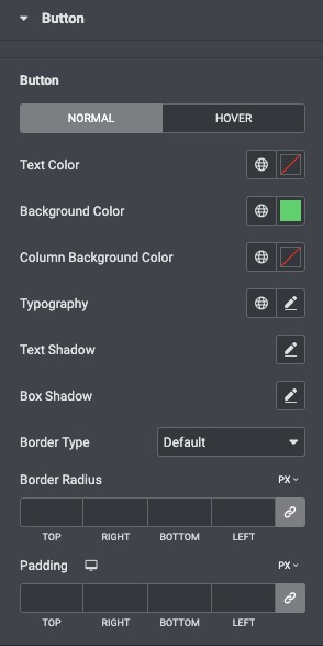
- Text Color: Choose the color of the button’s text.
- Background Color: Choose the background color of the button.
- Column Background Color: Select the background color for the button row.
- Typography: Set the typography options for the button’s text.
- Text shadow: Set the text-shadow of the button.
- Box shadow: Set the Box shadow of the button.
- Border Type: Select the border type, from none, solid, double, dotted, dashed, or grooved.
- Border Radius: Set the border radius of the button to control corner roundness.
