
Widgets
Content Switcher
The EAE-Content Switcher widget allows you to switch between multiple content options in one place. You can also use Elementor templates, AE – Templates, and sections inside the content section.
Content
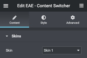
Skins
- Skin: Select the layout from the preset layout skins.
Content
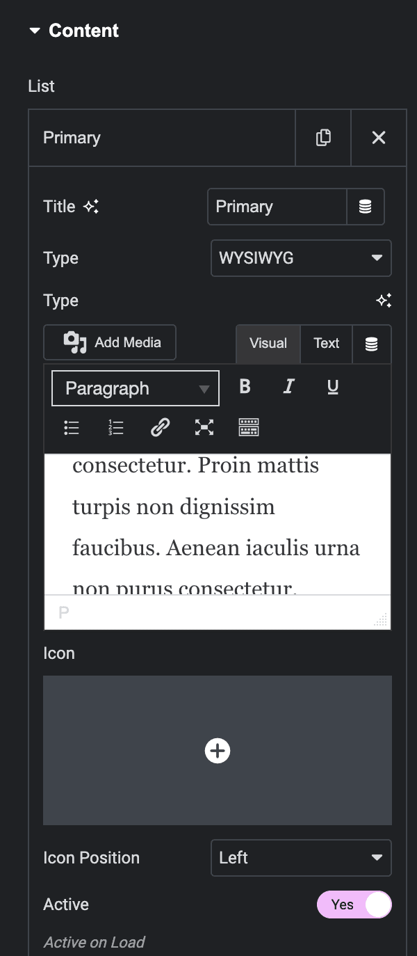
- Title: Give a suitable title for each list item
- Type: Select existing Elementor templates and Sections, AE – Templates, or add your content directly in the Richtext editor. In the editor, you can edit the text visually and add images from the Media Library.
- Icon: Set an icon for each item in the switcher
- Icon Position: Adjust the position of the icon like left or right
- Active: Toggle the switch to set the content active on load.
Display Settings
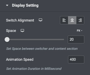
- Switch Alignment: Set the alignment for the switcher button, and select from left, right, or center.
- Space: Set the space between the switcher and the content section.
- Animation Speed: Set the animation duration in milliseconds.
Style
Switch
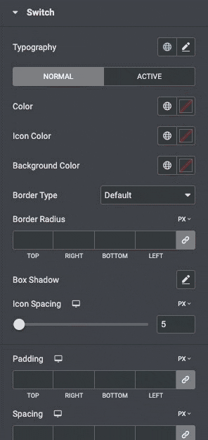
- Typography: Set the typography options for the text inside the switch button
- Color: Choose the background color of the switcher for Normal and Active States
- Icon Color: Set the icon color.
- Background Color: Select the background color.
- Border Type: Select the type of border, choosing from none, solid, double, dotted, dashed, or grooved
- Border-radius: Set the border radius of a switch.
- Box-shadow: Set the box shadow of the switch.
- Icon Spacing: Adjust the space between the icon and the text.
- Padding: Set the padding.
- Margin: Set the margin.
Box Style
- Box Color: Set the Box color.
- Box Padding: Set the box padding.
- Border Type: Select the type of border, choosing from none, solid, double, dotted, dashed, or grooved.
- Border-radius: Set the border radius of a switch.
Switch Bar
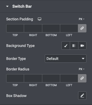
- Section Padding: Set the padding parameters for the switcher container section.
- Background Type: Set the background type for the container.
- Border Type: Select the type of border, choosing from none, solid, double, dotted, dashed, or grooved.
- Border Radius: Set the border radius around the container to control corner roundness.
- Box Shadow: Set the box shadow.
Content
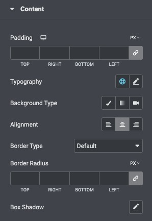
- Padding: Set the padding for the content
- Typography: Set the typography.
- Background Type: Choose the background type from classic or linear.
- Alignment: Select the alignment.
- Border Type: Select the type of border, choosing from none, solid, double, dotted, dashed, or grooved
- Width: Set the width of the border around the content section
- Color: Choose a color for the border
- Border Radius: Set the radius of the border to control corner roundness.
- Box Shadow: Set the box shadow.
