Widgets
Filterable Gallery
EAE – Filterable Gallery widget lets you create an attractive image gallery for your website. It allows you to group images into categories and easily access them using clickable filters. This gallery widget comes with various advanced features through which you can easily represent and style your portfolios.
Content
General
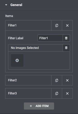
Click on the ADD Item button to add filters. Give the filter a proper name, then add multiple images to the filter item.
Settings
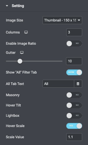
- Image Size: Set the image size from thumbnail to full , or enter a custom size.
- Columns: Set how many columns will be displayed per row from 1 to 6.
- Enable Image Ratio: Control the space between each image in a row.
- Gutter: Adjuat the gutter margin accordingly.
- Show Alt Filter tab: If set to Yes, enter the desired label. “All” is the default.
- Masonry: Enable it to display images seamlessly.
- Hover Tilt: Enable to get a tilted effect on hover.
- LightBox: Choose to display images in a lightbox.
- Hover Scale: Enable or disable the hovering scale.
OverLay Setting
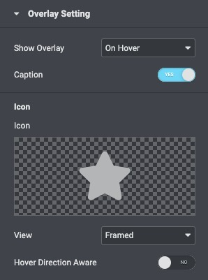
- Show Overlay: Select when the Overlay effect appears for the images like OnHover, Always, Hide on Hover, or Never.
- Caption: Hide or Show Captions.
- Icon: Select an icon to be displayed on hover.
- View: Choose the default icon view, or select Stacked or Framed.
Style
General
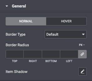
- Border Type: Choose the thickness of the border for Normal and hover state.
- Border Radius: Control the corner roundness of the image border.
- Item Shadow: Enable this option if you want to access the advanced shadow settings for the items and need to apply shadow for them.
Image
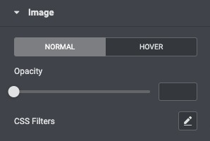
- Opacity: Set the Opacity for the image.
- CSS Filters: Set CSS Filters, selecting from Blur, Brightness, Contrast, and Saturation for Normal and Hover states.
Overlay
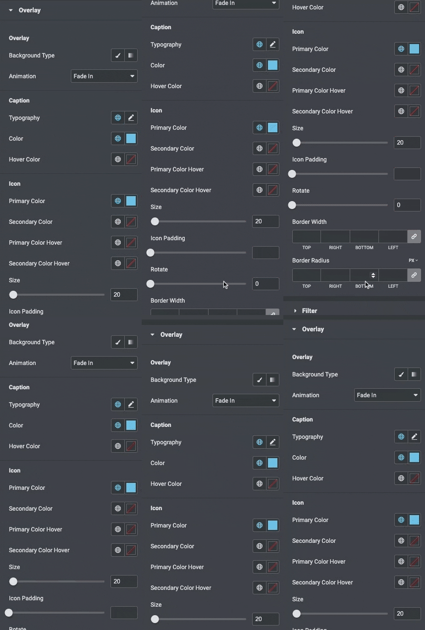
- Background Type: Choose a classic or gradient type for the widget overlay.
- Animation: Choose the overlay’s Entrance or Exit animation upon hover.
- Color: Choose the Description’s color.
- Typography: Set the typography options for the Caption.
- Primary Color: Choose the primary color of the icon.
- Secondary Color: Choose the secondary color of the icon.
- Primary Color Hover: Choose the primary color of the icon on the hover state.
- Secondary Color Hover: Choose the secondary color of the icon on the hover state.
- Size: Choose the size of the icon.
- Icon Padding: Set the amount of padding around the icon.
- Rotate: Rotate the icon to any angle.
Filter
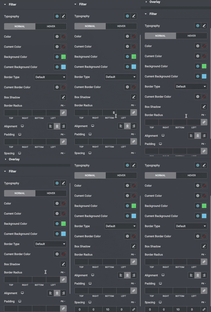
- Typography: Set the typography options for the Filter bar text.
- Color: Choose the color of the Filter bar text for Normal, Hover states.
- Current Color: Choose the color of the Filter bar text for active states.
- Background Color: Choose the background color of the Filter bar for Normal, Hover, and states.
- Current Background Color: Choose the background color of the Filter bar for active states.
- Border Type: Set the type of border, choosing from None, Solid, Double, Dotted, Dashed, or Groove.
- Curent Border Color: Choose the border color for the active item.
- Border Radius: Set the border radius, to control corner roundness.
- Alignment: Align the bar to the left, right, or center.
- Padding: Control the amount of space between the Filter text and the gallery images.
- Spacing: Control the amount of space between Filter text items.
