
Widgets
Modal Popup
EAE – Modal Popup widget allows you to create small popup windows displayed on performing a certain action. Through this, you can get more content from Custom Fields and Post Archives without navigating from one page to another.
Content
Content
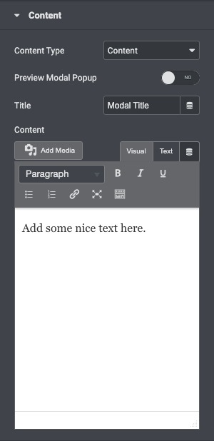
- Content-Type: Choose the type of content you want to display in the popup window, like Custom Content, Saved Page, Saved Section, or AE Template.
- Preview Modal Popup: If you want to preview the pop window, you can enable it.
- Title: Give a Title to be displayed at the top of the popup window.
- Content: Enter content manually or select the source of the Content-Type that you choose on the top accordingly.
Modal Setting
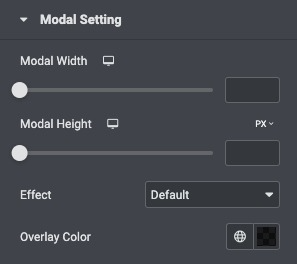
- Modal Width: Here, you can assign the width to the pop-up window.
- Modal height: You can assign the height to the pop-up window here.
- Effect: Choose from the list of effects.
- Overlay Color: It allows you to choose the color for the overlay.
Display settings
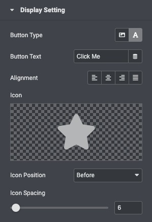
- Button Text: Here, you can give the text to the Model Popup button.
- Alignment: You can adjust the positioning of the button (left, center, right, justified).
- Icon: Select an icon to be displayed along with the button text.
- Icon Position: Adjust the position of an icon like before or after the text accordingly.
- Icon Spacing: Adjusted the space between the icon and the text.
Style
Popup
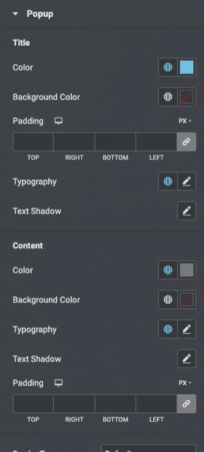
Title
- Color: Choose the popup text color
- Background Color: Select the popup background-color
- Padding: Adjust the padding around the popup
- Typography: Set the typography settings of the title
Content
- Color: Select the color for the popup text
- Background Color: Select the background color
- Padding: Adjust the content padding
- Typography: Set the typography settings of the content
- Border Type: Select the type of border, choosing from none, solid, double, dotted, dashed, or grooved
- Border Radius: Set the border radius to control corner roundness for each side of the popup
- Box Shadow: Adjust box-shadow options
Button
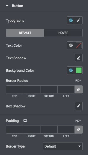
- Typography: Set the typography options for the button’s text
- Text Color: Choose the color of the button’s text
- Text Shadow: Apply shadow to the button text
- Background Color: Choose the background color of the button
- Border Radius: Set the border radius of the button to control corner roundness
Close Button
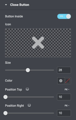
- Button Inside: Enable it to position the close button inside the popup window.
- Icon: Select an icon to close the popup.
- Icon Size: Adjust the icon size.
- Color: Select the Close button for both the Normal and Hover states.
- Position Top: Adjust the close icon position from the top.
- Position Right: Adjust the close icon position from the right side.
