Team Member
The “EAE – Team Member” widget is a versatile tool that allows users to introduce information about their team members. It enables users to display vital information such as team member names, images, designations, and descriptions in an eye-catching and organized manner.
Additionally, it provides the flexibility of adding social media links to team members’ profiles, making it easy for visitors to connect with them. The widget also includes a button feature that directs users to the full profile of a team member if they want to learn more.
With various styles available, the Team Member widget allows users to showcase their team member profiles in a visually appealing way.
The “Team Member” widget features the following controls:
Content
General
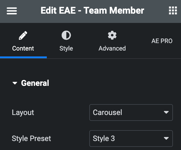
- Layout: Choose either Grid or Carousel.
- Style Preset: Choose a style from the various options available.
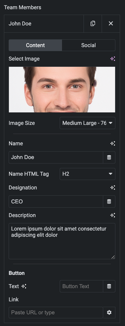
- Team Members: Use Add Item to add team members.
- Content
- Select Image: Select the team member image.
- Image Size: Set the size of an image.
- Name: Enter the team member’s name.
- Name HTML Tag: Select the HTML tag for name.
- Designation: Enter the designation of a team member.
- Description: Enter the description.
- Button
- Text: Enter the button text.
- Link: Enter the URL to link with a button.
- Content
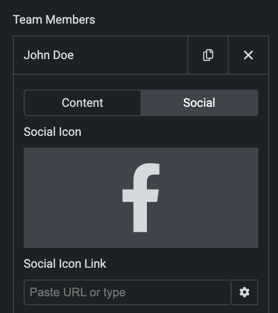
- Social
Note: Users can add up to five social media profiles.
- Social Icon: Select social icon from Icon Library or upload SVG.
- Social Icon Link: Enter the URL to link with social icon.
- Preview Overlay Content: Toggle the option to preview overlay content during editing mode based on the selected style preset.

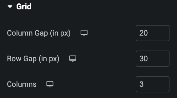
Grid
Note: These options are only applicable if you select Grid as Layout in the General Section.
- Column Gap: Set the item’s column gap in px.
- Row Gap: Set the item’s row gap in px.
- Columns: Specify the number of columns displayed in each row.
Settings
Image
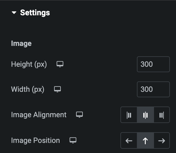
- Height: Enter the height of image in px.
- Width: Enter the width of image in px(applicable for Style 1 only).
- Image Alignment: Choose from Start, Center, or End.
- Image Position: Choose from Left, Up, or Right(applicable for Style 1 only).
Content
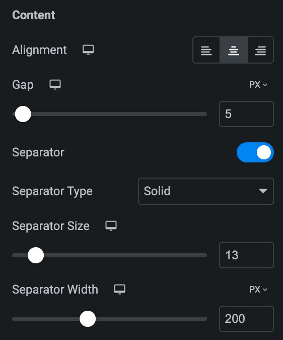
- Alignment: Choose from Left, Center, or Right.
- Gap: Enter the gap between the content.
- Separator: Enable the option if needed.
- Separator Type: Select the type of Separator.
- Separator Size: Set the size of Separator.
- Separator Width: Enter the width of Separator using px or %.
Social Icon
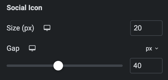
- Size: Set the size of Social Icon.
- Gap: Enter the gap between social icons using px, EM, or %.
Slider Options
Note: These options are only applicable if you select Carousel as Layout in the General Section.
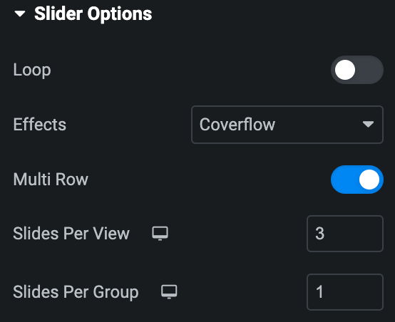
- Loop: Activate the option to enable slide looping.
- Effects: Choose from Fade, Slide, Coverflow, or Flip.
- Multirow: Enable the option if needed(applicable if the above Loop option is not enabled).
Note: These options are only applicable for Slide and Coverflow effects.
- Slides Per View: Specify the number of slides to be displayed in a row.
- Slides Per Group: Specify how many slides should move together when navigating through the slider.
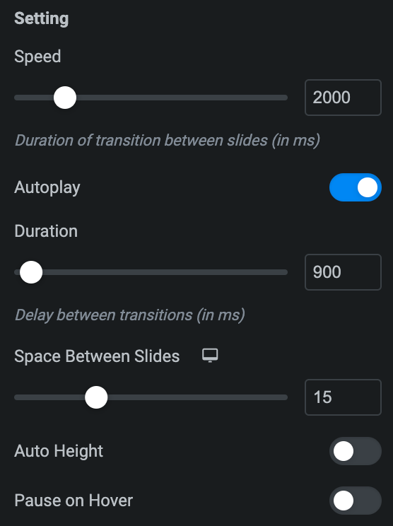
Setting
- Speed: Set the transition speed when moving one slide to next in ms.
- Autoplay: Activate the option to enable autoplay while onload.
- Duration: Set the duration for transition.
- Space Between Slides: Set the space between slides.
- Auto Height: Enable the option to set the auto height.
- Pause On Hover: Enable the option to pause slides during hover.
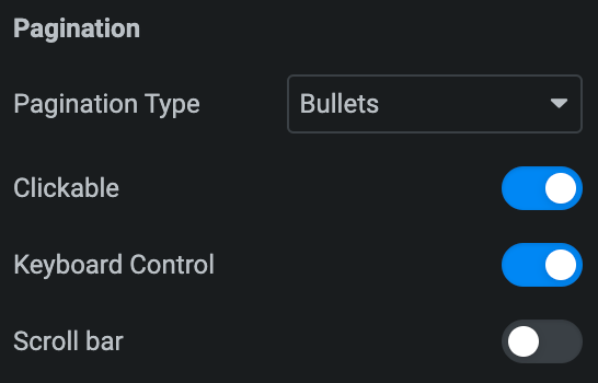
Pagination
- Pagination: Set the pagination type.
- Clickable: Enable the option to make arrows clickable(only applicable for Bullets Pagination type).
- Keyboard Control: Activate the option to enable keyword control.
- Scroll bar: Enable the option to display the scroll bar.
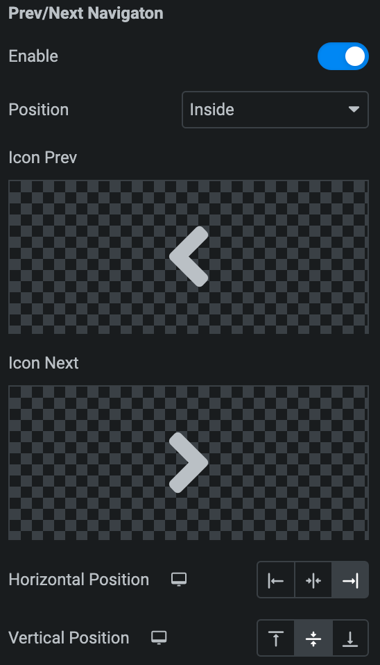
Prev/Next Navigation
- Enable: Activate the option to display the arrows.
- Position: Choose either from Outside or Inside.
- Icon Prev: Set previous icon either from the library or upload SVG.
- Icon Next: Set Next icon either from the library or upload SVG.
- Horizontal Position: Select from Left, Center, or Right.
- Vertical Position: Select from Top, Middle, or Bottom.
Style
General
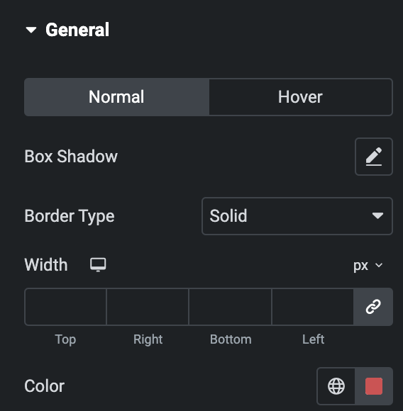
- Normal
- Box Shadow: Set box-shadow properties.
- Border Type: Select the border type.
- Width: Enter the width of border.
- Color: Select the color for border.
- Hover
- Styling controls for the hover state are available under this section. These settings will be applied when Someone hovers the Item Box.
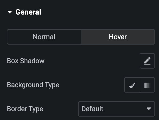
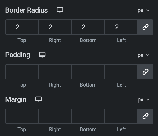
- Border Radius: Set border-radius properties.
- Padding: Set the padding.
- Margin: Set the margin.
Image
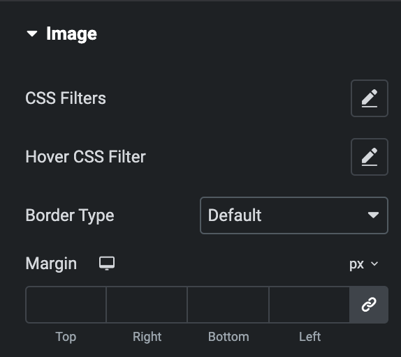
- CSS Filters: Set the CSS filters properties.
- Hover CSS Filters: Set the filters for hover image.
- Border Type: Select the border type.
- Width: Enter the width of border.
- Color: Select the color for border.
- Margin: Set the margin.
Overlay
- Hover Direction: Select the hover direction on overlay.
- Size: Set the size.
- Background Type: Select either Classic or Gradient.
- Classic
- Color: Choose the color for the background.
- Image: Either upload an image or select a dynamic tag for display.
- Gradient
- Color: Select the color for the background.
- Location: Determine the position of the color on the background by specifying their location in percentage.
- Second Color: Select the second color for the background.
- Location: Determine the position of the second color on the background by specifying their location in percentage.
- Type: Select either Radial or Linear.
- Radial
- Position: Set the position.
- Linear
- Angle: Set the angle using DEG, GRAD, RAD, and TURN.
- Radial
- Classic
- Blend Mode: Select the blend mode.
- Border Radius: Set border-radius.
Content
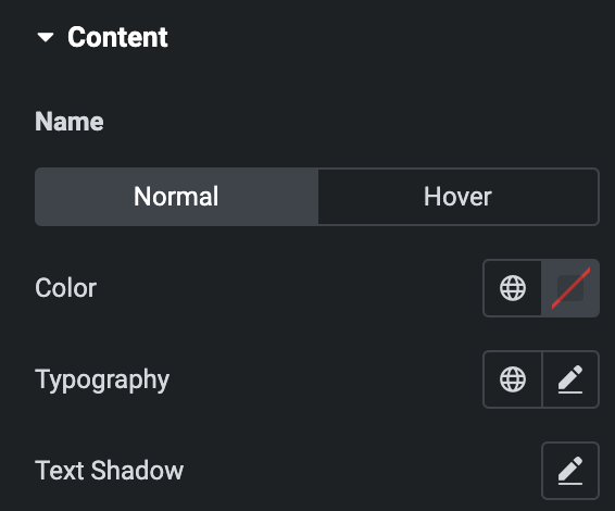
- Name
- Normal
- Color: Select the color for name.
- Typography: Set the typography.
- Text Shadow: Set the text-shadow.
- Normal
- Hover
- Styling controls for the hover state are available under this section. These settings will be applied when Someone hovers the item box.
- Margin: Set the Margin.
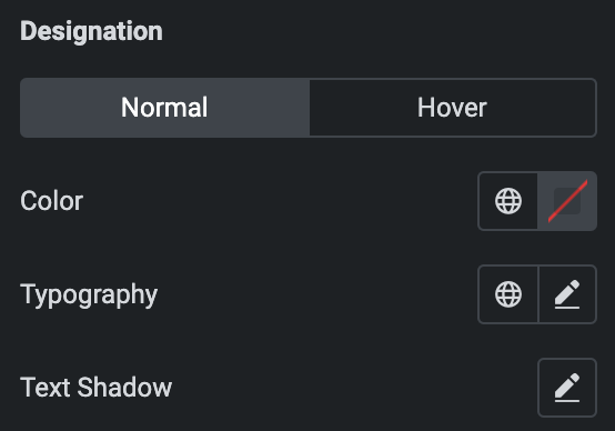
- Designation
- Normal
- Color: Select the color for name.
- Typography: Set the typography.
- Text Shadow: Set the text-shadow
- Normal
- Hover
- Styling controls for the hover state are available under this section. These settings will be applied when Someone hovers the item box.
- Margin: Set the Margin.
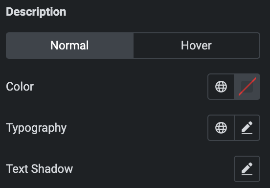
- Description
- Normal
- Color: Select the color for name.
- Typography: Set the typography.
- Text Shadow: Set the text-shadow.
- Normal
- Hover
- Styling controls for the hover state are available under this section. These settings will be applied when Someone hovers the item box.
- Margin: Set the Margin.
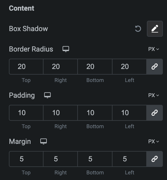
- Content
- Box Shadow: Set the box shadow.
- Border Radius: Set border radius.
- Padding: Set the padding.
- Margin: Set the margin.
Social Icons
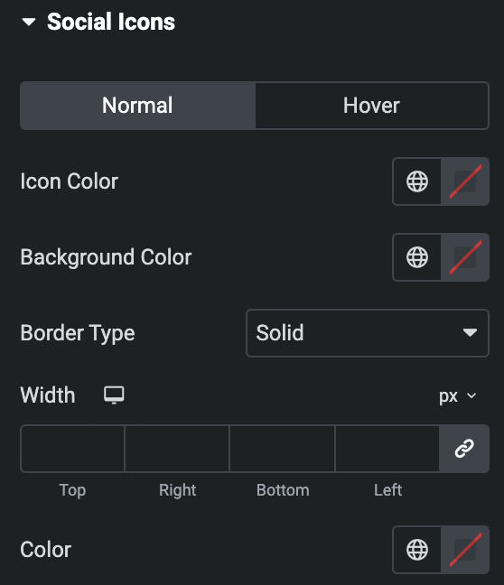
- Normal
- Icon Color: Select the color of social icons.
- Background Color: Select the background color of icon.
- Border Type: Select the border type.
- Width: Set the width of border.
- Color: Select the color of border.
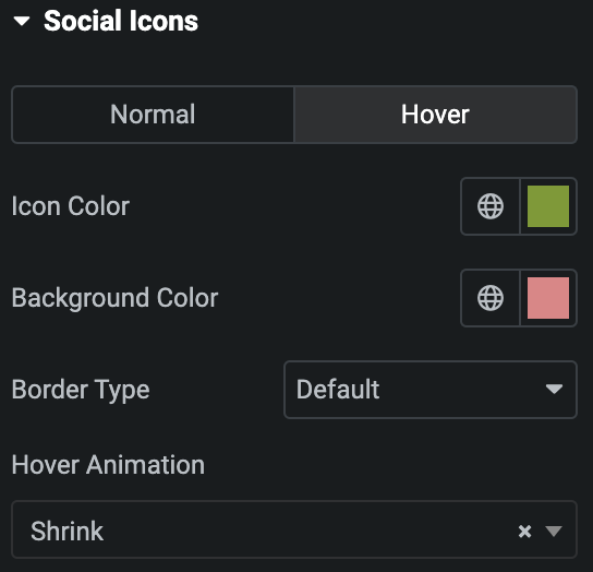
- Hover
- Styling controls for the hover state are available under this section. These settings will be applied when Someone hovers the social icon.
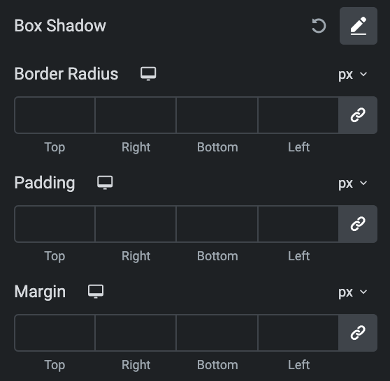
- Box Shadow: Set box-shadow properties.
- Border Radius: Set border-radius properties.
- Padding: Set the padding.
- Margin: Set the margin.
Button
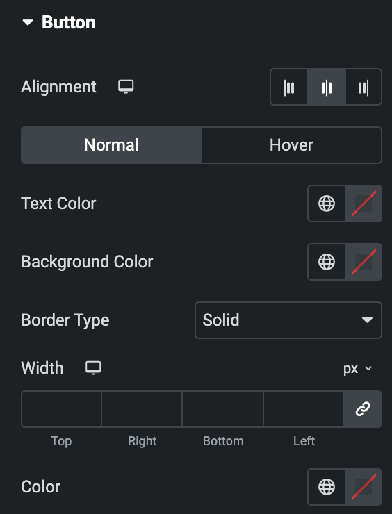
- Alignment: Select button alignment from Left, Center, or Right.
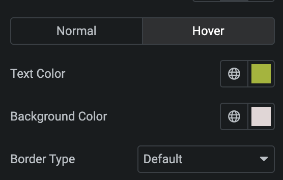
- Normal
- Text Color: Select the text color of button.
- Background Color: Select the background color of button.
- Border Type: Select the border type.
- Width: Enter the width of border.
- Color: Select the color for border.
- Normal
- Hover
- Styling controls for the hover state are available under this section. These settings will be applied when Someone hovers the button text.
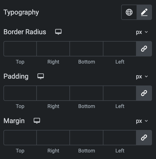
- Typography: Set the typography of button text.
- Border Radius: Set border-radius properties.
- Padding: Set the padding.
- Margin: Set the margin.
Box
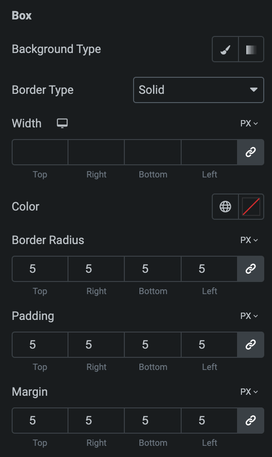
- Background Type: As we mentioned above, Select either Classic or Gradient. Click here.
- Border Type: Select the border type.
- Width: Enter the width of border.
- Color: Select the color for border.
- Border Radius: Set border-radius properties.
- Padding: Set the padding.
- Margin: Set the margin.
Carousel
Note: These options are only applicable if you select Carousel as Layout in the General Section.
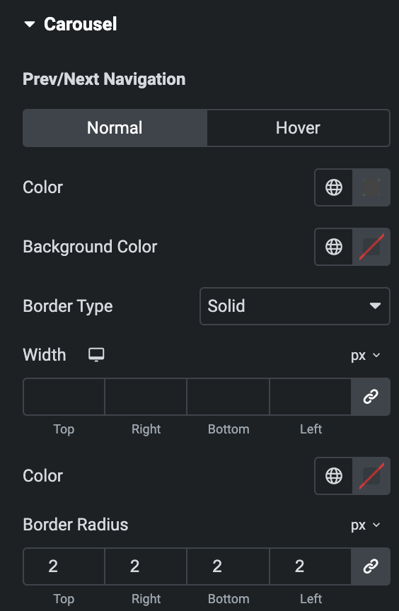
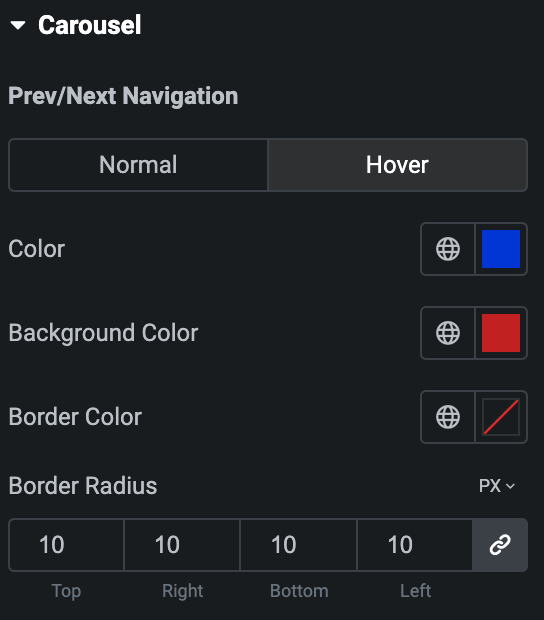
- Prev/Next Navigation
- Normal
- Color: Select the color of navigation.
- Background Color: Select the background color of navigation.
- Border Type: Select the border type.
- Width: Enter the width of border.
- Color: Select the color for border.
- Border Radius: Set the border radius.
- Normal
- Hover
- Styling controls for the hover state are available under this section. These settings will be applied when Someone hovers the Navigation.
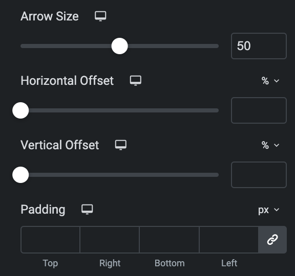
- Arrow Size: Set the size of arrow.
- Horizontal Offset: Set the horizontal offset.
- Vertical Offset: Set the Vertical offset.
- Padding: Set the padding.
Note: Only applicable when enabling Scroll bar Type in Slider Options section.
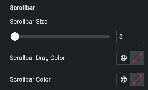
- Scrollbar
- Scrollbar Size: Set the size of scrollbar.
- Scrollbar Drag Color: Select the color for scrollbar drag.
- Scrollbar Color: Select the scrollbar color.
Note: Only applicable when selecting Pagination Type in Slider Options section, Section name and features vary based on the selected Pagination Type.
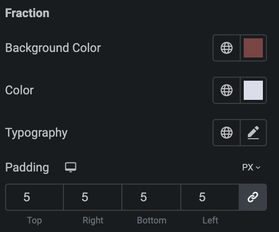
- Fraction
- Background Color: Select the background color of pagination.
- Color: Select the color of pagination.
- Typography: Set the typography.
- Padding: Set the padding.
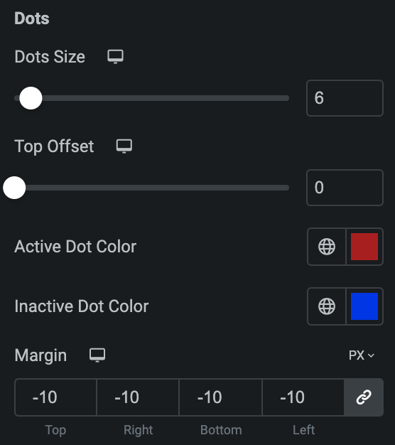
- Bullet
- Dot Size: Set the bullet dot size.
- Top Offset: Set the offset from the Top.
- Active Dot Color: Select the color for active state.
- Inactive Dot Color: Select the color for inactive state.
- Margin: Set the margin.
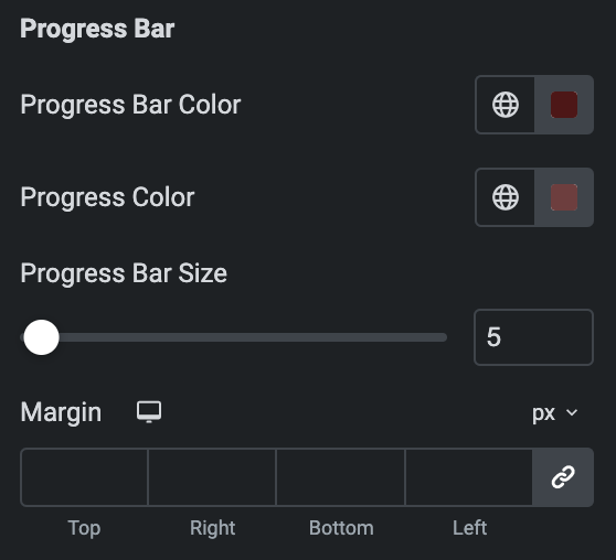
- Progress Bar
- Progress Bar Color: Select the color of progress bar.
- Progress Color: Select the color of progress.
- Progress Bar Size: Enter the size of progress bar.
- Margin: Set the margin.
