Flip Box
The EAE – Flip box widget creates an attractive information box for your website. You can switch the box from one side to another and easily customize each box element. Icons, text, images, and buttons can easily be added to both sides of the box.
Content
Front Box

- Icon: Select an icon from the FontAwesome library
- View: Choose the default icon view, or select Stacked or Framed
- Shape: If Stacked or Framed is chosen, choose Circle or Square
- Title: Here, you need to input the title for the front-side content of the animated box.
- Html Tag: Select the HTML tag to render the box title.
- Text: Enter the content to be added to the front side of the box.
Back Box
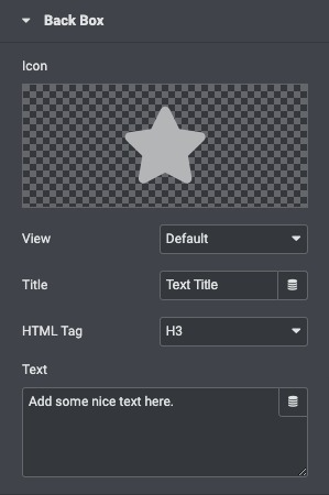
- Icon: Select an icon from the FontAwesome library.
- View: Choose the default icon view, or select Stacked or Framed.
- Shape: If Stacked or Framed is chosen, choose Circle or Square.
- Title: Here, you need to input the title for the backside content of the animated box.
- Html Tag: Select the HTML tag to render the box title.
- Text: Enter the content to be added to the back side of the box.
Action Button
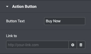
- Button Text: Choose the text that appears inside the button
- Link TO: Choose where the button points to. Enter the URL of the page in the link.
Style
General
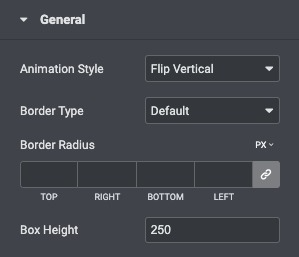
- Animation Style: Select the animation style for the box.
- Border Type: Set a border to the entire flip box.
- Border Radius: Set the radius of the border to control corner roundness.
- Box Height: Set the height of the flip box.
Front Box
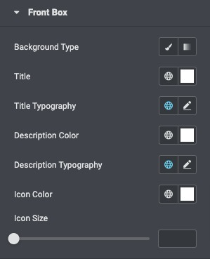
- Background Type: Choose a Color or Gradient as the background of the front of the flip box.
- Title: Choose the color of the title.
- Title Typography: Set the typography settings of the title.
- Description Color: Choose the color of the description.
- Typography: Set the typography settings of the description.
- Icon Color: Select the icon color for the front side of the box.
- Icon Size: Adjust the size of the icon.
Back Box
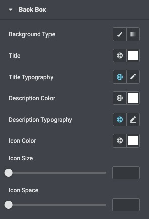
- Background Type: Choose a Color or Gradient as the background of the back side of the flip box.
- Title: Choose the color of the title.
- Title Typography: Set the typography settings of the title.
- Description Color: Choose the color of the description.
- Typography: Set the typography settings of the description.
- Icon Color: Select the icon color for the back side of the box.
- Icon Size: Adjust the size of the icon.
Action Button
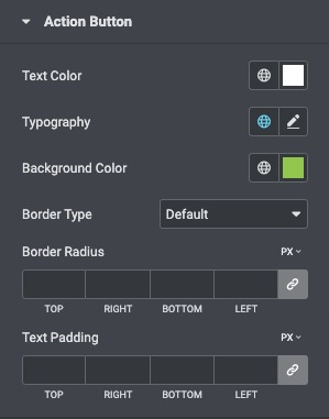
- Text Color: Choose the text color of the button.
- Typography: Customize the typography of the button text.
- Border Type: Choose a border for the action button None, Solid, Double, Dotted, Dashed, or Groove.
- Border Radius: Control the border radius of the button.
