Price Table
The EAE – Price Table Widget allows you to display your product price and the services you offer, attractively and clearly. The widget contains various customization options to style each section of the table.
Content
Plan Heading
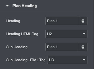
- Heading: Enter the title of the specific price plan
- Heading Html Tag: Set the Header’s Title tag, choosing from H2 – H6
- Sub Heading: Enter the subtitle that appears below the main title
- Sub Heading Html tag: Set the HTML tag for the subheader, choosing from H2 – H6
Price Box
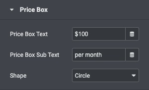
- Price Box Text: Set the exact pricing of your product or service.
- Price Box Sub Text: Enter extra text to be displayed in the price box
- Shape: Select to display the price inside a circle or a square
Features
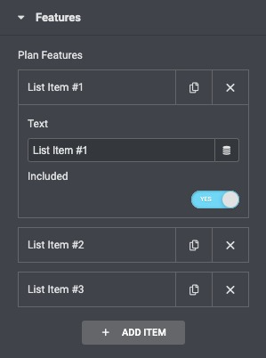
A list of all the features you are offering. You can drag and drop them to change their order. Click on the Add Item button to add another item to the list.
Action Button
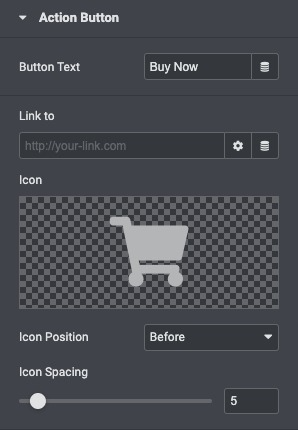
- Button Text: Write the text that will appear for the button.
- Link To: Choose where the button points to. Enter the URL of the page in the link.
- Icon: Select an icon from the FontAwesome library.
- Icon Position: Adjust the position of an icon like before or after the text accordingly.
- Icon Spacing: Adjusted the space between the icon and the text.
Style
Box Style
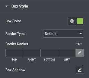
- Box Color: Choose the background color for the top section of the widget.
- Border Type: Select the border type from none, solid, double, dotted, dashed, or grooved.
- Border Radius: Set the border radius of the button to control corner roundness.
- Box Shadow: Add a box shadow effect to the table.
Plan Heading
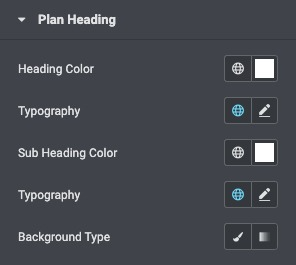
- Heading Color: Choose any color for the main title.
- Typography: Select the heading typography.
- Sub Heading Color: Choose a subheading color.
- Typography: Select the subheading typography.
- Background Type: Select the background type for the heading area.
Price Box
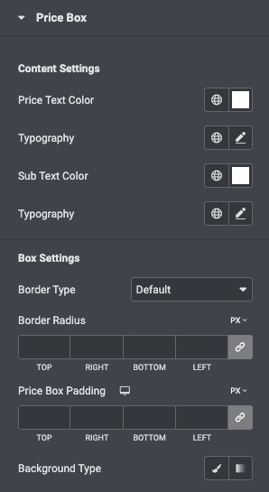
- Price Text Color: Choose any color for the main title.
- Typography: Select the heading typography.
- SubText Color: Choose the subheading color.
- Typography: Select the subheading typography.
- Background Type: Select the background type for the heading area.
Feature List
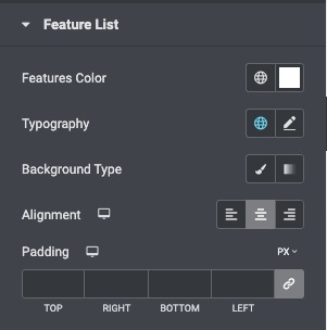
- Feature Color: Choose the color of the features list text.
- Typography: Set the typography options for the features list text.
- Color: Choose the background color of the features list.
- Image: Upload an image to be used as a background.
- Alignment: Align the list to the right, left, or center.
- Padding: Customize the padding of the features list.
Action Button
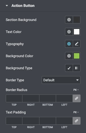
- Section Background: set the background color for the button section
- Text Color: Choose the color of the button’s text.
- Typography: Set the typography options for the button’s text.
- Background Color: Choose the background color of the button.
- Border Type: Select the border type, from none, solid, double, dotted, dashed, or grooved.
- Border Radius: Set the border radius of the button to control corner roundness.
- Text Padding: Set the distance between the button text and the border.
Button Hover
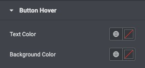
- Text Color: Set the button text color on hover.
- Background Color: Set the button background color on hover.
